Mixed Chart IELTS Writing Task 1 - Combination Chart
Last updated: Jan 7, 2026Are you aiming to master the IELTS Academic Writing Task 1 Mixed Chart question? You’re not alone—many candidates find combination charts challenging. But worry not! In this blog, we’ll guide you through how to effectively approach Mixed or Combination Chart tasks, which often include two or more visuals like line graphs, tables, or charts. Sometimes, more than one type of chart is combined. Learn how to analyze and structure your response to boost your chances of scoring a higher band in the IELTS Writing section.

Summarise with AI
Choose your AI AssistTable of Contents
Introduction to Academic Writing Task 1 Mixed Chart
Explaining the graphs and charts in the IELTS writing task 1 can be tedious. However, combining more than one graph, chart, or table becomes more complex. For example, a question consisting of a table chart and a bar graph. This task tests skills necessary for comparing data, spotting trends, or elucidating the connections between various data sets. Moreover, you need to maintain accuracy while presenting the information clearly and coherently. In the next section, you'll find key steps to effectively tackle the IELTS Writing Task 1 mixed chart and boost your score.
 Take Writing Mock Test Now!
Steps to Write IELTS Mixed Chart Writing Task 1
If you also want to answer the mixed chart task 1 perfectly and get a high score, then here are a few steps that can help you do that:
Step 1: Before drafting the answer, it is important that you read the question carefully. Study the graphs and understand the details they represent. Also, look for any trends they might depict.
Step 2: Plan the response you will write to explain the two graphs. For mixed chart task 1, you can follow the introduction, body paragraph, and conclusion template.
Step 3: Write a brief introduction of the two charts. You can also use the question and paraphrase it to write the introduction.
Step 4: After the introduction, give an overview of the features that are depicted by the two graphs.
Step 5: Next, in the task 1 mixed chart, you can explain the key features in detail. You can also include data from the charts given to you.
Step 6: Lastly, summarize the content that you have written in a few lines.
This is how you can successfully answer the mixed data charts. Now, take a look at some of the sample answers.
Mixed Chart Samples for Reference
When you are preparing for the combination chart task 1, it is essential to refer to some of the sample answers. These will help you understand how you can format your response. In addition, the fulfillment of scoring criteria and question requirements can also be understood with these samples. Thus, the following are three different ways to answer the combination task 1:
Sample 1
This is the first sample of the task 1 mixed chart question:
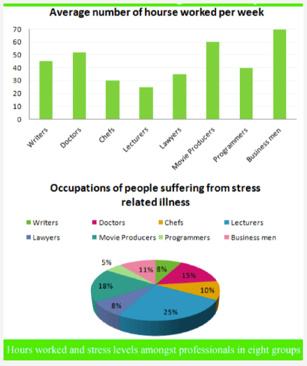
The pie chart shows the percentages of people in each field who suffer from stress-related illnesses, while the bar chart shows how many hours each group works each week.
Among the eight groups, businessmen typically put in the most hours, while academics typically put in the least. Moreover, academics have the greatest stress at work. Despite working less than any other category in the chart, professors have the highest job-related stress.
According to the bar graph, businessmen and film producers worked the most hours, roughly 70 and 62 hours a week, respectively. On the other hand, lecturers only worked about twenty-five hours a week. Other professionals, such as doctors, writers, programmers, lawyers, and chefs, worked 52, 46, 35, and 32 hours a week, respectively.
According to the pie graph, professors have the greatest rate of stress-related disorders among professionals, at 25%. The rates for doctors and movie producers are likewise high, at 15% and 18%, respectively. The percentages for business people, attorneys, chefs, and authors fall between 11 and 8%. Lastly, programmers are only at 5%.
Sample 2
Here is another sample answer that you can use while working on the blend chart task 1 from the writing section:
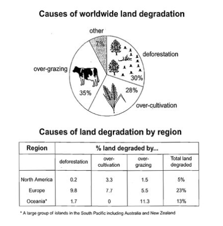
The table shows how the various issues influenced three parts of the world in the 1990s, while the pie chart shows the main reasons why farming land deteriorated. The pie chart makes it evident that, out of the three main causes, overgrazing is the main factor contributing to farmland degradation. According to the table, the proportion of unproductive land in Europe during this time period was significantly larger than that of the other two regions. Overgrazing accounts for somewhat more than one-third of the four reasons shown in the pie graph. Overuse of crops accounts for slightly more than a quarter, and widespread tree removal for almost one-third of the causes. According to the table, degeneration has affected around 25% of Europe's total land area. Oceania had a somewhat greater value at 13%, and 5% of North America's entire land became less productive.
Sample 3
Another alternative method that you can employ to answer the combination chart task 1 is as follows:
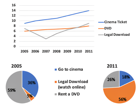
The line graph shows the cost of watching movies, while the pie charts show the evolution of the market share held by the three categories.
Over six years, the average cost for all three movie viewing methods increased, but by 2011, downloading movies became the most popular way for individuals to watch movies.
The most expensive tickets were for the movies, which went from £9 to almost £14 per ticket by 2011. In a similar way, the cost of a DVD increased from £6 to £8. Movie downloads were more expensive than DVDs in 2005 (about £7), but they abruptly plummeted to £3 in 2007 and became the least expensive option to watch films. However, by 2011, the price had increased once more to £9. The largest percentage of people who rented DVDs (59% of the total) was in 2005, while the smallest percentage of people downloaded movies (2% of the total). In the same year, little more than one-third of individuals watched movies at theatres. But by 2011, the percentage of people who went to the movies and rented DVDs fell to 18% and 26%, respectively, while the percentage of people who downloaded movies grew to more than half.
These are some of the sample answers and questions for mixed chart task 1. Next, take a look at some of the strategies to attempt this task.
Strategies to Excel in Mixed Chart
- Practice Frequently: Learn the different types and combinations of graphs. To improve yourself, practice answering a variety of IELTS task 1 combination graph samples.
- Time Management: You can allocate twenty minutes for this assignment. Plan for the first few minutes, write for around fifteen minutes, and then spend a few more minutes reviewing your work.
- Coherence and Cohesion: Using appropriate linking words and phrases to ensure a smooth flow of ideas and logical connections between paragraphs.
- Use a Variety of Vocabulary: To increase your band score, use a variety of IELTS vocabulary and sentence structures. Avoid repetitive words and phrases.
- Check Accuracy: When describing the facts in IELTS writing task 1 combination chart, make sure you are using the right numbers and tenses.
- Carefully Proofread: Before sending in your response, set up a time for proofreading to fix any spelling or grammar mistakes.


Conclusion
In conclusion, these are some of the samples of a mixed chart that you can get in the IELTS academic writing task 1. You can also use other such questions that are available online. If you have any further questions regarding IELTS writing task 2 or 1, you can connect with experts at Gradding. This is an online platform that can aid you with test preparation and offer you various resources.
FAQs
1. How should I structure my response when dealing with IELTS Writing Task 1 multiple charts?
A well-structured response should include an introduction, a synopsis of the main trends, and separate paragraphs outlining specific data points and comparisons. Provide an explanation of the graphs' findings, followed by a summary that emphasizes the key trends. After that, carefully go over each graph in the body paragraphs, comparing and contrasting the data as necessary.
2. Will I lose marks if I don't write enough words?
Yes. If you don't write the required number of words in mixed data chart explanation, you will lose marks in 'Task Achievement' for not answering the question fully.
3. Can I use idioms?
No, idioms are often not appropriate for Writing Task 1. They can, however, be used if you have to compose an informal letter for the General Training exam.
4. How many paragraphs should I write?
You need to include four paragraphs in blend chart task 1, Introduction, Overview, Details 1, and Details 2. You can also put the overview at the end if you'd like.
0 comments

Practice Makes a Man Perfect!Take FREE ielts Mock Tests
Start FREE Mock Test


Get Unlimited Access with
IELTS Prep Boost
Mock Tests
Practice Questions
Study Material
Recorded Classes
What is your Target IELTS Band?


Get familiar with the Real IELTS Exam for Free!
Start Free Mock Test