IELTS Academic Task 1 Table Chart Topics 2026
Last updated: Jan 9, 2026Are you still crying over the split milk of not solving the table chart task 1 properly? Worry no more, as we are here to cover you. This is the describe image question type that assesses the skill of understanding any object and expressing information through the answer. In addition to becoming proficient in solving the writing task 1 table chart, you need to do tons of practice. For that sample would be a game changer for you. Thus, read our blog to explore its meaning, steps, format, five samples, and tips. So let’s start.

Table of Contents
Introduction to Table Chart Task 1
The table chart task 1 presents a table chart that consists of numerical data in a systematic format. You will be provided a visual representation of data in a tabular format. In this, you have to do a comparison of figures, quantitative data, average sums, identification of relationships, and trends. Moreover, these tabular charts are commonly used to demonstrate statistics on topics such as income, population, production, wages, and more.
The structure of the writing task 1 table chart involves two rows and columns, which structure the data into categories systematically. The major purpose of IELTS writing task 1 is you have to demonstrate and evaluate information by making comparisons concisely and clearly.
Additionally, you have to complete this within 20 minutes and in 150 words (within 200 words). Thus, knowing the right structure is vital to answering. Therefore, in this, you need to summarise the answer and give clarification after understanding the table. This overview will assist you in knowing about the table chart task 1 and how to solve this. Now, let’s move forward to know the steps to write the answer to this question.
 Take Writing Mock Test Now!
Steps to Write the Answer to Task 1 Table Chart
Crafting an answer to the Table Chart Task 1 can be challenging by analysing the table and consisted data and summarising the answer. Evaluating the statistics and doing a comparison to provide a valuable answer is vital. Thus, to effectively craft an IELTS table chart essay, you need to follow certain steps. In this section, we have shared 5 simple steps that will help you to write Table Chart Task 1. So let’s explore.
1. Analyse the Table and Question- first of all, understand the table to know the type of data it comprises. Afterwards, look for the pattern and select the main feature.
2. Identify the Main Feature and Supporting Data- read and evaluate the table at least 3-5 times to explore the key features such as high or low statistics, number or amount. Focus on key points, provide specific details, and make comparisons.
3. Plan Your Response– now start outlining which features and points will be added in which part of the answer. It consists of an introduction, an overview, and a body paragraph. Also, use precise vocabulary in your answer to make it more impressive.
4. Write the Introduction and Overview- After planning, it’s time to write an introduction, rephrase the questions in your own words, and include the table title and variables. In overview, add trends, key points, and more.
5. Write the Details in the Body Paragraph- In the body paragraph, you have to provide a detailed description. On the topics and information you have analysed. Also, contrast categories and highlight the key difference in the table writing. Additionally, do not repeat the numbers and express data in a meaningful way.
Additional Bonus Point
Maintain the precise and formal language by using accurate grammar, showing a discrepancy in sentence structure, and expressing trends and important points accurately. Also, use the appropriate linking words in your response.
This is how you have to answer the task 1 table chart question. Follow these steps to craft the winning answer and impress the examiner. Note that using clear language and vocabulary can foster your answer. Thus, understand the IELTS syllabus to know how you can answer this writing task. Hence, to comprehend these steps more clearly, go through the sample mentioned below to know how to answer this question.
Samples of Table Chart Task 1
When it comes to practices and understanding table task 1 in IELTS, samples are considered candidates’ best friends. Thus, Table Chart Task 1 could be challenging to solve, but a sample can help you to learn the right format and approach to answering. So, explore five samples that consist of a tabular chart and an answer to give.
IELTS Table Chart Sample 1
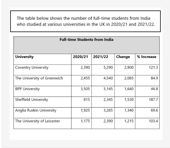
The table shows the number of full-time students from India. Who studied at various universities in the UK in 2020/21 and 2021/22.
Sample answer
The table above shows a large number of full-time students from India pursuing their higher studies in the top six British universities in two academic years, 2021 and 2022. Also, there is an increase in percentage and number.
Overall, it can be seen that the greatest increase in Indian students studying is at Sheffield University, while the BBP University presents the lowest increase in these two years. However, in the first year, BPP University was in the top position to have a high number of Indian students, and in the other year, Coventry University was on top.
Sheffield University saw an impressive growth of 187.7%, where Indian students, reaching "815" to "2345" from 2020 to 2021. Similarly, it can be observed that the number has climbed the ladder for Coventry University by "2900" students (121.3%). Another significant rise was seen at Leicester University from 1175 to 2,390 students, a rise of 103.4%. Many other colleges have gained massive growth as many Indian students get enrolled in these two years.
IELTS Table Chart Sample 2
Sample answer
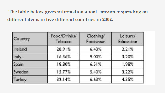
The table articulates the proportion of consumer spending in Ireland, Italy, Spain, Sweden, and Turkey on three different types of consumer goods for 2002.
Overall, the category of goods on which all the countries spend more is food/drink/tobacco, which is three times higher compared to other goods types. The least spending category is education and leisure in all five countries. However, the expenditure in Turkey in the food category is higher than in other countries.
In terms of food/drink/tobacco, Turkey spent the most, 32.14%, Ireland was high, 28.91%, in comparison to Sweden, which spent the least, 15.77%. Spain and Italy spent less in this category. If you look at Turkey, they are on top in all categories. In clothing/ footwear, Turkey is again on top, and Sweden is at the bottom. Thus, it can be estimated after evaluating all three categories and countries that Turkey spends the most,t and Sweden spends the least on all three consumer goods.
IELTS Table Chart Samples 3
Sample answer
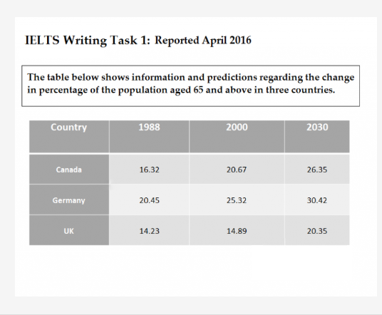
The table demonstrates the information and prediction regarding the changes in the percentage population of the population aged 65 years and over in three countries (Canada, Germany, and the UK) in 1988, 2000, and an estimated percentage for 2030.
Overall, the population of elderly people is estimated to rise in all three countries over the given period. It is estimated that the highest percentage of older people comes from Germany, which is anticipated to remain the highest for the entire period of time. In contrast, the lowest population is estimated to be in the UK.
Moreover, between 2000 and 1988, the ageing population in Canada and Germany rose by around 5% to 20.6% and 25.32%. The UK, on the other hand, had minimal variation in the percentage of its population aged 65 and above, hovering around 15% in both years.
It is anticipated that by 2030, the population of people aged 65 will increase by 5.5% in all three countries. Moreover, it is estimated that the percentage will reach 30.42% in Germany, 26.35% in Canada, and 20.35% in the UK.
IELTS Table Chart Samples 4
Sample answer
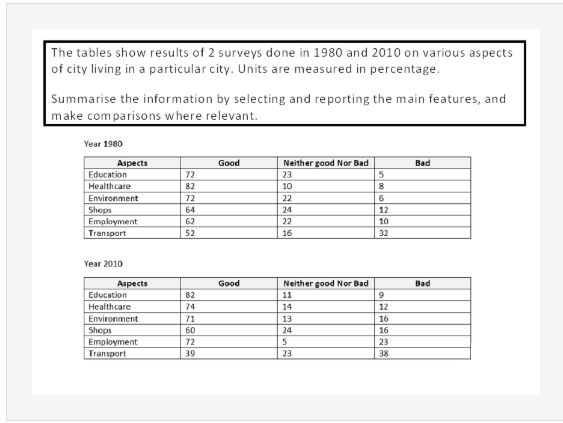
The table above showcases the proportion of people assessing the six aspects of one city’s life in a specific city.
Overall, healthcare, education, and environment have given the maximum scores in both years, and transport amenities received the minimum. Meanwhile, the education rating category climbed the ladder over the period; on the other hand, transportation fell.
In 1980, healthcare, education, and the environment were ranked high by the people, with an over 80% rise in the improvement in the healthcare category, while the other two categories had 72%. Under 10% of the defendants shared that three services were bad this year. 62-64% is for shopping and unemployment, and 22-24% of people shared that they were average. Only half of the people surveyed gave high scores to the transportation, with a roughly equal number of people giving this category bad reviews.
Turning to 2010, the most significant changes were seen in education, and 80% of people were happy with this, and in healthcare, people gave a rating to 74%. The employment sector has improved in 2010, as indicated by those given the positive satisfaction. In contrast, the transportation percentage fell to 39%, and a similar fraction of people said it was bad. In the last shopping and environment sector remained no change.
IELTS Table Chart Samples 5
Sample Answer
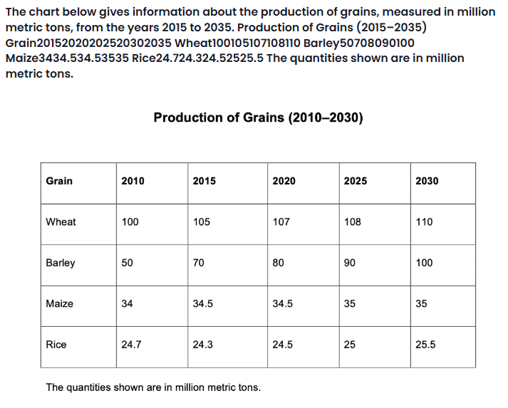
The table graph given above shows the cultivation of four different types of crops, like wheat, barley, maize, and rice, from 2015, and demonstrates the next few years. The data stated is calibrated in million metric tons.
Overall, it can be evaluated that the production of all types of grains is increasing, especially for wheat, from 100 in 2010 to 110 in 2030. However, rice seems to be low in 2010, that is "24.7", and gradually the production increased to "25.5" in 2030. Wheat holds the majority, and rice is the least produced among the other crops. The barley was "50" in 2010, which got a good rise and is estimated to reach "100" in 2025, and will remain the same in 2030. In 2010 was at "35" and predicted to be the same amount in 2030.
By observing the tabular chart, it can be it is observed that the framers grew crops of "100" to "105" million metric tons of wheat in two years 2010 and 2015, which rise to "108" million metric tons in 2025, and it is estimated that this figure will be increased by the 2 million metric tons by the year 2030.
These are the samples of the Table Chart Task 1. Understand this sample and the structure of answers. To identify your weaknesses and strengths in the table task 1, you can give a mock test. It is designed just like the IELTS exam with the same difficulty and question types.
Strategies to Use While Solving the Table Chart Task 1-
To ace the exam, IELTS preparation is important. Here are some of the tips that can assist you in writing an effective answer in the table chart task 1. So let’s have a look.
1. Understand the Task and table to know the data types, such as in percentage periods, or other variables.
2. Carefully analyse the data in the column and row.
3. Identify key features, trends, and patterns to add to the table writing
4. Provide a summary or overview of the overall key points or trends.
5. Go into specific details to provide a detailed descriptionfocusing on the significant changes, comparisons, and highest/lowest points.
6. Connect ideas effectively by using linking words such as "whereas," "while," "in contrast," and "similarly."
7. Structure your answer with an introduction, overview, and body paragraphs, each emphasising precise trends and details.
8. Make sure to have accuracy and clarity in the answer
Conclusion
Taking everything into account, the table chart task 1 is one of the descriptive image questions in IELTS academic writing task 1. We have covered every necessary point in this blog, from its overview to tips. Moreover, shared 5 samples that will help you to understand the approach for writing an IELTS table chart essay. So, if you want to learn more about describing image questions like IELTS process diagrams, pie charts, mixed charts, etc. Then you can connect to our experts at Gradding.com. They will help you to ace these questions and the overall IELTS exam.
FAQs
1. How to do a table chart question in IELTS?
Answer: To solve a table chart question in IELTS, you can use these five steps to score a high band in the IELTS writing sections.
- Analyse the Table and Question
- Identify The Main Feature and Supporting Data
- Plan Your Response
- Write The Introduction and Overview
- Write the details in the Body Paragraph
2. What is a table chart with an example?
Answer: The table chart questions mean arranging the data in rows and columns. The table comprises the data and statistics that can help you estimate and compare the value. Later, by evaluating this, you have to craft the answer. For example
Let's say a table chart in IELTS writing demonstrates the literacy rates of diverse countries over five years. The table may have:
Rows: Signifying distinct countries (e.g., UK, USA, Canada, Australia).
Columns: Presenting different years (e.g., 2018, 2019, 2020, 2021, 2022).
Data: The percentage literacy rate for each country in each year.
3. What are the advantages of table charts in IELTS?
Answer: The table chart in IELTS writing task 1 provides various advantages for showing and analysing data. They are mainly useful when working with large data, as they provide an organised format of the table that makes it easier to classify patterns and trends.
4. What kind of information do I need to write about in the IELTS Task 1 Table Chart?
Answer: In the IELTS Writing task 1, you have to describe and assess visual information, like tables, to describe an image. Organise your answer after analysing the table and use the right words for your IELTS Writing task 1 answer. Use the data mentioned in the table and perform a comparison between the variable and the data to check which data is high and low.
5. How much time is there for IELTS Writing Task 1 - Table Chart?
Answer: In academic task 1 of the IELTS writing task 1, students are provided with images, such as a table or chart. In this, students get 20 minutes in which they have to write 150 words to explain their answer.
0 comments

Practice Makes a Man Perfect!Take FREE ielts Mock Tests
Start FREE Mock Test


Predict your IELTS Band

98% students got exact IELTS Band
What is your Target IELTS Band?


Get familiar with the Real IELTS Exam for Free!
Start Free Mock TestWe are available in :
BangaloreAhmedabadJaipurHyderabadKeralaPuneChandigarhMumbaiGurgaonChennaiKolkataTrivandrumNoidaKochiCalicutKottayamKollamThrissurIndoreUdaipurdisclaimer:logos and other registered trademarks of universities used on this platform are held by their respective owners. Gradding does not claim ownership or association on them, and their use is purely for informational and illustrative purposes.