PTE Describe Image Template 2026: Practice Samples with Answers
Last updated: Jan 5, 2026Preparing for a PTE describe image task may seem challenging initially, but think of it as a quick storytelling challenge. Consider the image provided to you is your script, and in 40 seconds, you have to transform the data, diagram, or picture into a clear and precise description. Here, the catch is you don't have to be a proficient public speaker; it's just employing the correct approach and accurately following the PTE Describe image template.
In this guide, you will discover the correct template, expert tips you must follow during your preparation, and describe image PTE samples for a better understanding of the task.
Note – Want to dive deeper into scoring, image types, and expert strategies? Check out our complete PTE Describe Image blog for all the details.

Summarise with AI
Choose your AI AssistTable of Contents
PTE Describe Image Template
The PTE describe image task can be seen as a high-scoring task if you follow the correct approach and tailor it according to the picture type. Here is the reliable PTE describe image template that you must follow to ensure your response is correct.
1. Introduction: Starting your response confidently is key to achieving a high score, as it demonstrates your understanding of the image. You can start with - The image given is (any type given) that shows (core topic or theme of the image).
2. Key Features: Once you have started, highlight the key features of the image using the following statements, which demonstrate your attention to detail.
- The most notable feature is (describe an evident trend, development, or any other feature).
- Another noteworthy mention is (use any secondary trend, changes in figures, proportion)
- It also features (any relevant or additional pattern)
3. Relationships or Patterns (if applicable): With the various types, there is a high possibility that you may encounter possible relationships or patterns. In this case, make sure to describe them properly. Here is the statement that you can use: The "image type" features a connection between (highlight any given relation or contrast between trend, figures, or any other element).
4. Conclusion: Lastly, end your response by shedding light on valuable insights into the image. For example: Overall, the image offers useful understandings into (the main theme or core idea of the image)


PTE Describe Image Samples with Answers
Understanding the template alone will not help you score high, as it requires practising with the latest samples, considering there are various types of images where you might get confused. Here are a few samples of PTE describe image with answers for each type that will help you prepare effectively.
Bar Graph PTE Describe Image
In the bar graph type, you must compare the categories using rectangular bars. In this type, ensure that you focus on the highest, lowest, and most visible trends that can make the response precise. Here are a few sample bar graphs to help with your preparation.
Sample 1
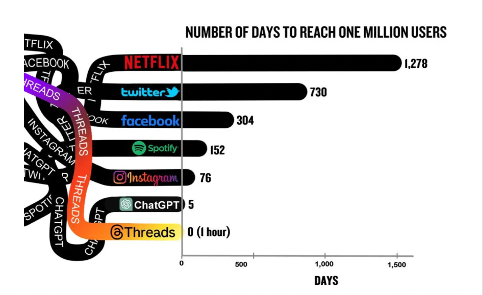
In the given bar graph, the time taken by various online platforms to reach one million users is shown. Starting with Netflix, which took the longest 1,278 days, followed by Facebook with 304 days, and Twitter with 730 days. Social media giant Instagram took only 76 days to reach the milestone, while Spotify did it in 152 days. Counting in ChatGPT, which reached one million users in just five days. Among all, Threads experienced the fastest growth, reaching one million users in zero days, basically, in just one hour. The information provides a clear overview of how quickly emerging platforms may amass sizable user bases.
Sample 2
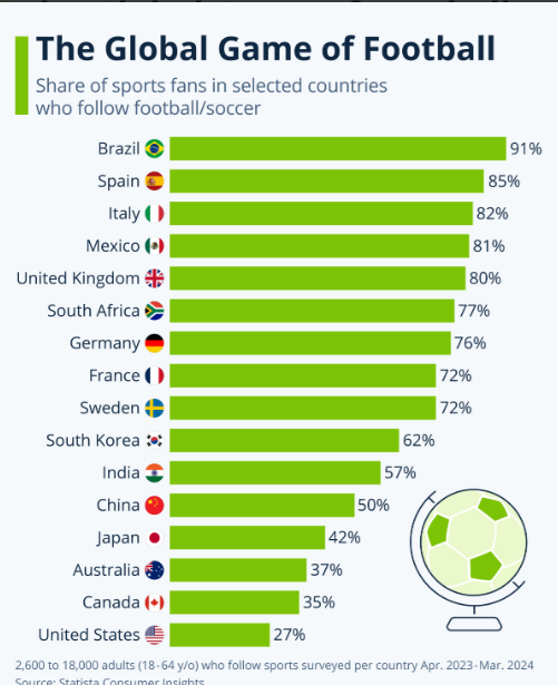
According to a survey conducted between April 2023 and March 2024, the proportion of sports supporters in a few selected countries who watch football is displayed in this bar chart. Football is the most popular sport in Brazil (91%), followed by Spain (85%) and Italy (82%). At 80% and 81%, respectively, the United Kingdom and Mexico likewise have significant levels of engagement. The United States, on the other hand, has the smallest number of football supporters (27%). Other nations with moderate degrees of interest include China, Japan, and Australia
Sample 3
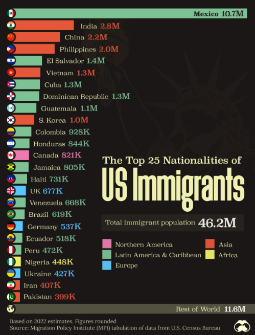
This bar chart specifies the 25 predominant nations of immigrants in the USA, according to 2022 projections. Having 10.7 million immigrants, Mexico is the largest country, followed by China (2.2 million), India (2.8 million), and the Philippines (2.0 million). With more than a million immigrants each, El Salvador, Vietnam, Cuba, South Korea, Guatemala, and the Dominican Republic are other important countries. Three European nations, the UK, Germany, and Ukraine, are also listed in the graph as major immigration destinations to the United States. According to the figures, there are 46.2 million immigrants overall, including 11.6 million of them falling under the "Rest of World" category.
Sample 4
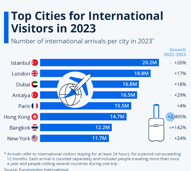
The most popular destinations for foreign visitors in 2023 are shown in this bar graph, along with the total number of foreign visitors in each city and the growth rates between 2022 and 2023. Starting with Istanbul, the capital of Turkey, has seen a rise of 26 per cent in visitors, with 20.2 million. Moving further, London has welcomed 18.8 million guests and seen a growth of 17%. Followed by Dubai and Antalya, which have visitors almost in the same numbers, 16.8 and 16.5, respectively, with a growth of 18% and 29%. Moreover, Paris has witnessed the lowest growth rate, 4% with 15.5 million visitors, while Hong Kong has experienced a massive growth of 2495%, with visitors reaching 14.7 million. Lastly, the bar graph includes Bangkok and New York with 12.2 and 11.7 million visitors, respectively. In 2023, Bangkok has seen a growth of 142% while New York has seen a growth of 24%.
Sample 5
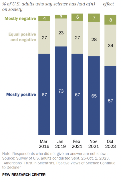
According to five separate surveys conducted between March 2016 and October 2023, the percentage of American adults who think science has a mostly positive, equally positive and negative, or mostly negative impact on society is shown in this bar chart. Between 2016 and 2023, the percentage of adults who saw science as primarily positive fell from 67% to 57%. The percentage of people who believe that science is primarily negative increased from 4% in 2016 to 8% in 2023. Lastly, the percentage who believe that science is equally positive and negative increased from 27% in 2016 to 34% in 2023.
Describe Image PTE Line Graph
In line graphs, use the data to analyse the trends, focusing on potential rises, falls, and overall patterns for a detailed response. Here are a few examples of line graphs to help with better understanding.
Sample 1
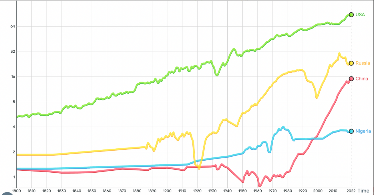
This line graph displays the average daily earnings for each country, including the United States, China, Russia, and Nigeria, in USD from 1800 to 2022. The average daily earnings in the USA, represented by the green line, have steadily increased and reached their highest point in 2022. Russia, represented by the yellow line, shows varying income levels with noticeable declines at the beginning of the twentieth century; however, overall growth continues through 2022. The red line represents China's income, which rises sharply after 1970, particularly towards 2022. Nigeria's income growth is depicted by the blue line as being slower and lower, with minor variations over time and a general decline since the year 1980.
Sample 2
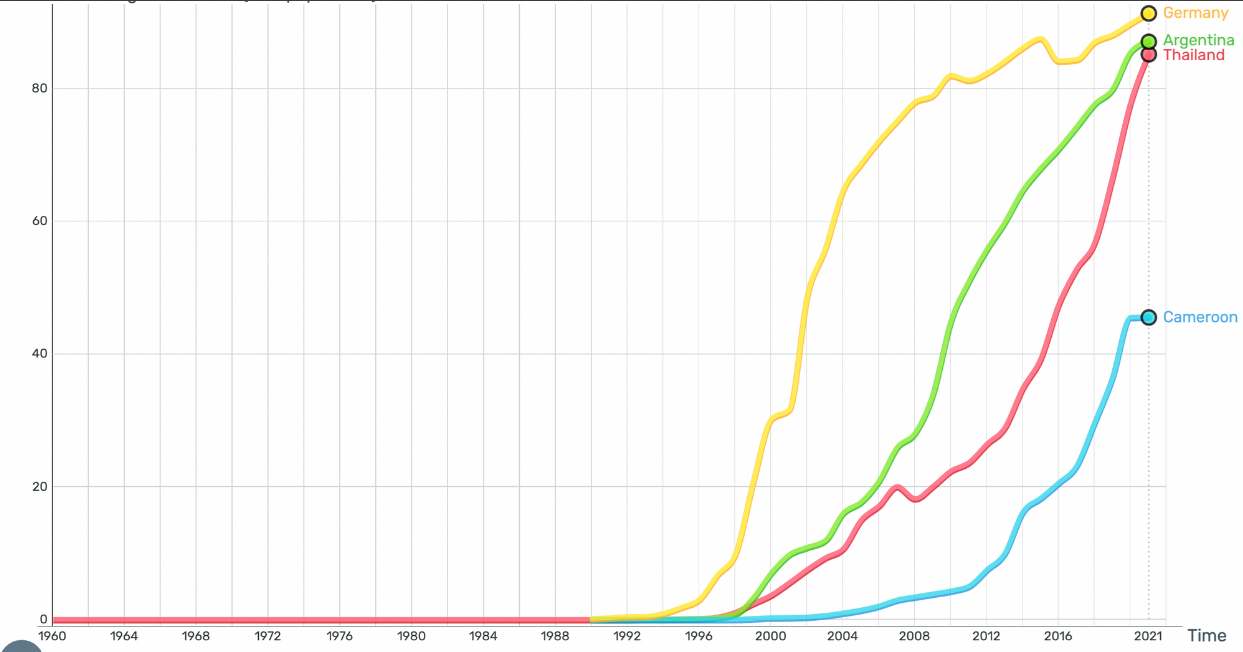
From 1960 to about 2021, the line graph illustrates the proportion of people in nations such as Germany, Argentina, Thailand, and Cameroon who use the internet. The final years of the 1990s witnessed a sharp increase in internet use in Germany, Argentina, and Thailand. By 2021, all three nations had achieved widespread usage rates of more than 80%. The fastest rise is seen in Germany, which is swiftly followed by Thailand and Argentina, suggesting that internet use is widespread. Differences in internet access are highlighted by Cameroon, which displays a slower rise in usage and a significantly lower acceptance rate, reaching just over 40% by 2021.
Sample 3
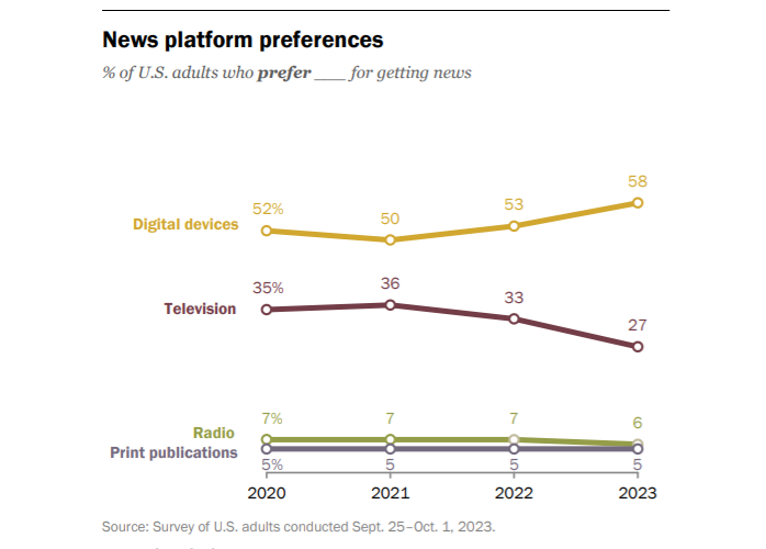
The usage habits of American adults for various news media between 2020 and 2023 are shown through this multi-line graph. From 52% in 2020 to 58% in 2023, this demonstrates a significant rise in consumer preference for digital devices. Moreover, the preference for television fell from 35% to 27% during this time. The use of both print publications and radio stayed low but relatively unchanged, with print staying at 5% and radio declining from 7% to 6%.
Sample 4
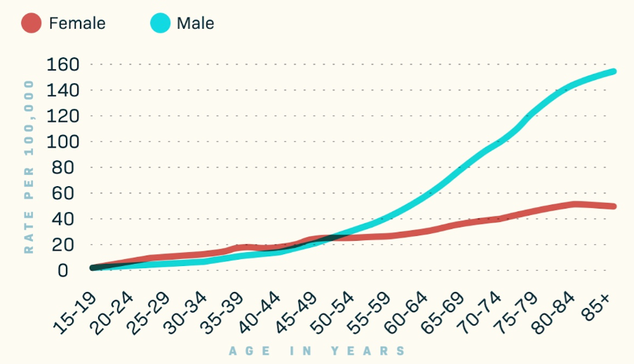
The occurrence rates of skin cancer in the US by age and gender are shown in this line graph. The rate of cancer rises with age in both males and females. As per the data, the occurrence of cancer is consistently higher in men than in women, and this difference is especially seen in older age groups. Moreover, the graph shows that the age range of 55–59 is where the cancer rates for the male population begin to vary significantly from those for females.
Sample 5
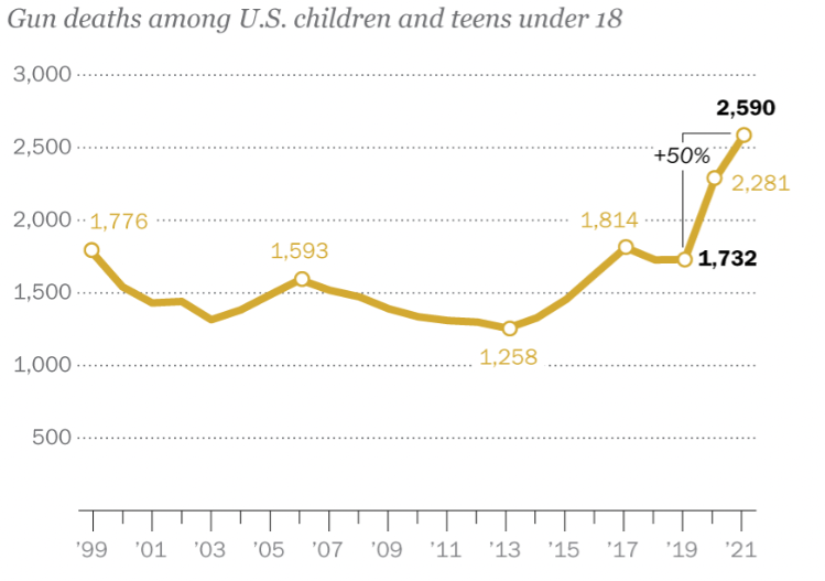
In this line graph, the number of gun-related deaths among children and teenagers in the United States between the years 1999 and 2021 is displayed. The graph indicates 1,776 deaths in 1999 and then reaches 1,258 deaths in 2013, showing a positive trend. Afterwards, the numbers began to increase again in the following years, reaching 1,732 in 2019 and then 2,590 in 2021. Overall, the line graph reveals a concerning pattern that warrants an immediate response.


Pie Chart Describe Image PTE
A pie chart presents the whole data in proportions or percentages. The best way to form its response is to stress the most significant, smallest, and all the important segments. Here are a few samples of pie charts for better practice.
Sample 1
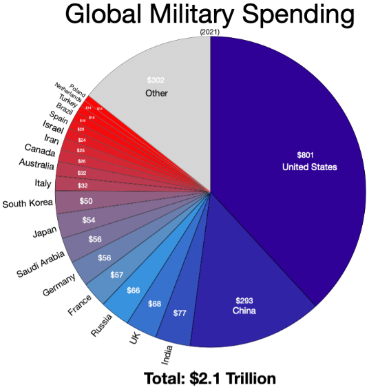
The $2.1 trillion worldwide spending for military in 2021 is shown in this pie chart. The largest contributor, the United States, spends $801 billion, substantially greater compared to any other nation. China comes in second with a spending of $293 billion. Russia ($66 billion), France ($57 billion), the UK ($68 billion), and India ($77 billion) are other significant spenders. With expenditures ranging from $50 to $57 billion, nations like South Korea, Japan, Germany, and Saudi Arabia are also included. The $302 billion in the "Other" section represents the aggregate spending of many other nations. The difference in military spending between the United States and the rest of the globe is highlighted by this graphic.
Sample 2
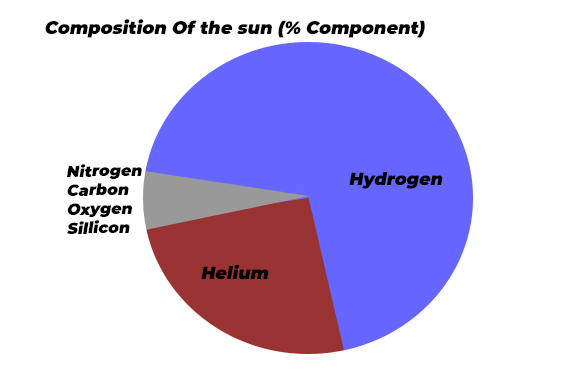
The proportion of the sun's components is displayed in the pie chart. According to the chart, hydrogen and helium are the components that make up the largest proportions of the sun's gas. Apart from that, components such as carbon, oxygen, silicon, and nitrogen are also found in extremely small amounts. Overall, hydrogen and helium can be considered the sun's main components.
Sample 3
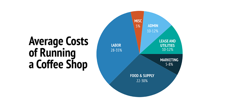
The costs associated with operating a coffee shop are broken down in the pie chart. Labour accounts for 28–35% of total costs, with food and supply costs coming in second at 22–30%. Approximately 10–12% goes into lease, utility, and office expenses, whereas 5–8% goes towards marketing. 5% is made up of miscellaneous expenses. According to the data, the two biggest expenses associated with running a coffee business are personnel and stock.
Sample 4
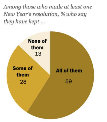
This pie chart illustrates the progress of American adults with their New Year's resolutions, as reported in a January 2024 study. Among those who made at least one resolution, 59% reported keeping all of them, while 28% said they had followed through on some. Lastly, 13% of the respondents said that they had broken their resolutions. Overall, this data shows that the group surveyed has dedicatedly followed New Year's resolutions.
Sample 5
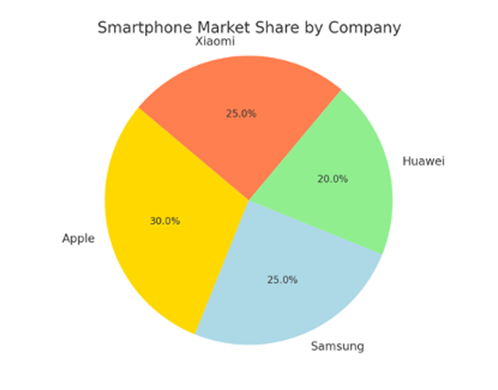
The market share of various smartphone brands is illustrated in the pie chart. Leading with 30% of the market, Apple is in first place, being closely followed by brands such as Samsung and Xiaomi at 25% and Huawei at 20% respectively. In essence, the market is extremely competitive, with Apple owning the largest share. Moreover, the relatively even distribution of market share shows fierce rivalry among leading brands.
Table Chart PTE Describe Image
In the table question type, the data is presented in rows and columns. Here you can focus on summarising the key figures and stress the major differences. Below are a few sample tables to help you prepare.
Sample-1
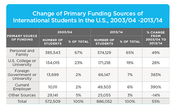
The table includes data on the primary financing sources for international students in the United States from 2003–04 to 2013–14. Funding primarily from family and personal sources has increased by 49%, reflecting the rise in the number of international students. Moreover, funding from U.S. colleges and universities increased by 28%. Among all, the biggest increases were from foreign governments and existing companies, which increased by 383% and 390%, respectively. Lastly, funding from other sources is expected to decrease by 14%. Above, during this time period, the 2013/14 academic year witnessed a 55% increase in international students compared to 2003/2004.
Sample 2
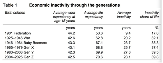
The percentage of life that each generation spends in the economy from 1901 to 2025 is presented in the table below. The data displays that individuals in 1901 worked for 44.2 years and were sedentary for just 17.6% of their entire lives. Moreover, the average lifespan rose sharply from 53.6 years in 1901 to 70 years in 2025. Above all, with the available data, it can be said that younger generations tend to become more inactive, with Generation Z and Y said to remain sedentary for 40% of their lives.
Sample 3
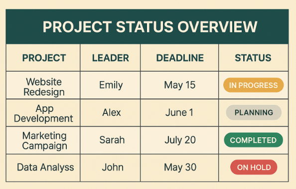
The table below showcases four business projects, including their reporting managers, due dates, and current status. Starting with the website redesign, which Emily is in charge of, needs to be completed by May 15. Furthermore, Alex is responsible for app development, which is currently in the planning stage with a due date of June 1. The marketing campaign led by Sarah is now complete; however, John's data analysis project, due on May 30, is currently on hold. Above all, the table displays an overview of the timetable and status of each project.
Sample 4
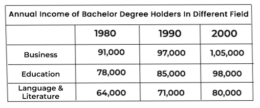
The yearly income of those with bachelor's degrees in business, education, language, and literature streams is shown in the table. Students who graduated from the business stream earned good money in each of the three years, with incomes ranging from $91,000 in 1980, $97,000 in 1990, and $105,000 in 2000. Comparatively, the range of wages for graduates in language and literature was $64,000 in 1980, $71,000 in 1990, and $80,000 in 2000. Apart from these two, those with degrees in education earn a medium salary, notably $ 78,000 in 1980, $ 85,000 in 1990, and $ 98,000 in 2000.
Sample 5
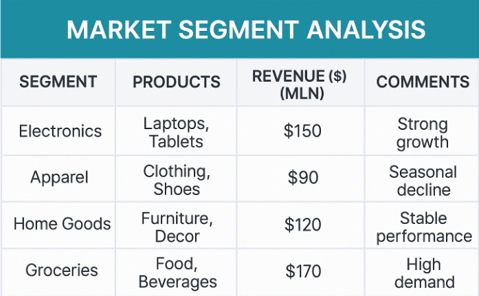
This table examines four market segments based on their revenue, performance, and products. Given the strong demand, groceries, including food and beverages, earn $170 million annually. Next up is our electronics segment, which includes tablets and laptops, generating $150 million in revenue and growing rapidly. Furniture and Decor are components of home goods that consistently produce $120 million. Despite a seasonal dip, the apparel sector, encompassing shoes and clothing, generates approximately $90 million annually. Overall, electronics and foodstuffs have the best performance in this table.
Describe Image Process/Flow Chart PTE
A process/flow chart is simply a type of diagram that explains a sequence of steps. Here, the perfect way is to define the stages clearly and focus on the final outcome. Scroll down for the latest samples of process charts to aid in better preparation.
Sample 1
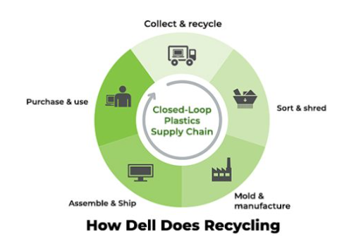
This figure illustrates Dell's recycling procedure using a closed-loop plastics supply chain. The process begins with the collection and recycling of products, which are then dispatched for classification and shredding. The components are then molded and produced at the facility. Next, every component of the computer is put together and prepared for shipping. At last, Dell PCs are available for purchase. In general, there are five primary steps in the recycling process.
Sample 2
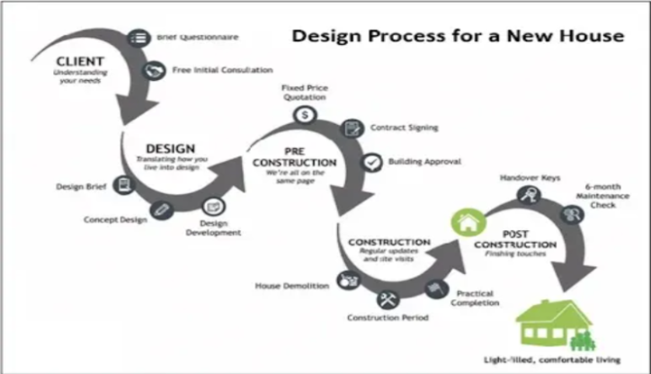
The given flowchart provides details on the process of planning and building a new house. It starts with the client completing a questionnaire and having an initial discussion about preliminary ideas. Furthermore, the design phase focuses on developing the concept, which is crucial for the pre-construction phase, where agreements, permissions, and pricing are finalised. Once everything is decided, the construction phase begins according to the estimated schedule. Lastly, after the thorough maintenance check, the key to the newly constructed home is handed over.
Sample 3
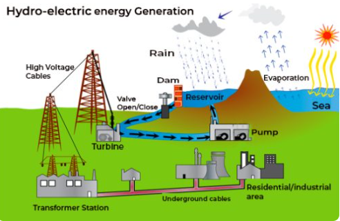
This is the entire process of producing hydroelectric electricity, which begins through the evaporation of water and continues through the gathering of rainfall in dams and reservoirs. The electricity is then produced with the aid of a pump and turbine and delivered to the transformer facilities via powerful wires. Lastly, hydroelectric energy is delivered to the industrial and housing sectors via subterranean lines. The process of generating electricity from seawater involves several steps.
Sample 4
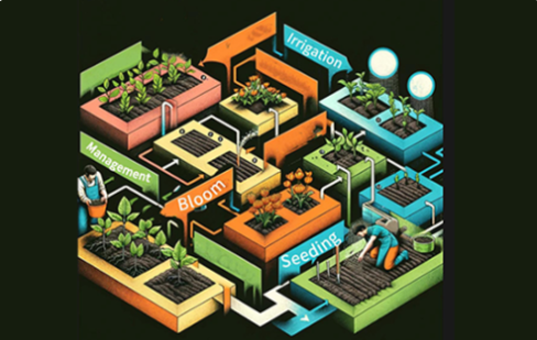
The given process chart shows various phases of plant development and agricultural management. It covers seeding, irrigation, blooming, and overall management. With the help of various coloured connecting blocks, the process aims to showcase systematic agricultural techniques. Overall, it emphasises how crucial organised farming methods are for the proper growth of plants.
Sample 5
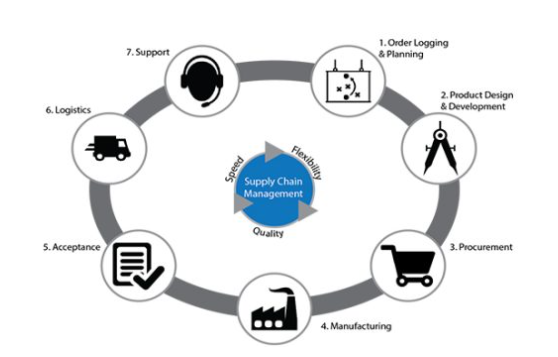
Through this flowchart, the supply chain management process is illustrated in terms of quality, speed, and flexibility. Order planning and logging, along with product design and development, are the initial steps. Additionally, a manufactured product must be delivered via logistics when the order is received. Lastly, the final step includes offering support to the advertised product.
PTE Describe Image Pictures
Pictures, as the name suggests, display real-life scenarios or situations. While framing your response, ensure that you define the vital elements, contextual details, and the complete theme of the image. Here are some examples of pictures to help you understand better.
Sample 1
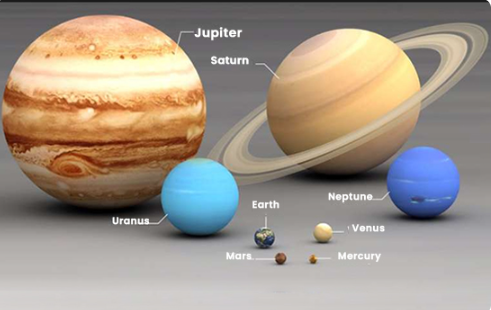
This picture provides details on the solar system. Jupiter serves as the largest planet, as can be recognised by its brown shade. Followed by Saturn, the second-largest planet, which is displayed by brown colour and has rings surrounding it. Lastly, there are many multiple small planets with Mercury being the smallest one, and it is followed by Mars, Earth, Venus, Uranus, and Neptune.
Sample 2
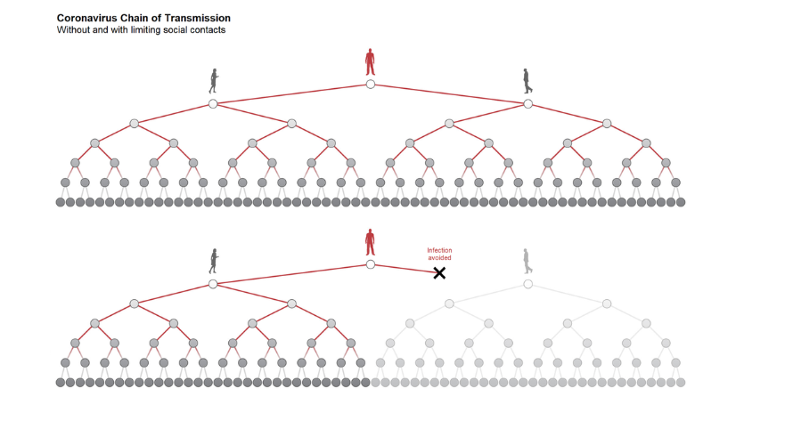
The picture shows how restricting social interactions can affect the spread of the coronavirus. The upper half depicts an unrestricted situation in which a single sick person starts a broad and growing chain of transmission that infects a large number of people. In the bottom half, a situation with few social contacts is depicted, which greatly slows the virus's transmission. Important areas are shown where possible transmissions are prevented as a result of these actions, clearly demonstrating a decrease in the number of afflicted people.
Sample 3

The given image displays a row of attractive houses filled with various colors, built along a fine water canal. Each of these houses has bright colors including, pink, yellow, orange, and blue, making a lively and vibrant atmosphere. This scene looks peaceful and well upheld, given the flowers hanging from balconies that are adding appeal. Overall, the picture shows a calm town with exceptional construction and pretty beauty.
Sample 4

The picture depicts the flags of two nations: Jordan and the UAE. On the right side, the flag of Jordan can be seen, with the United Arab Emirates on the left. Both flags share the colours red, green, white, and black, which is a simple way to describe their similarities. Jordan's flag is made up of three rectangles and one triangle, but the UAE's flag is made up of four rectangular pieces with one rectangle placed horizontally.
Sample 5
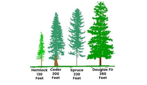
The image shows four distinct trees' heights in feet, with the Douglas fir being the tallest tree, standing at 280 feet. Moving ahead, spruce and cedar are next tallest trees with height at 230 and 200 feet, respectively. Lastly, Hemlock is at 130 feet tall, the shortest in all.
Map Chart PTE Describe Image
A map chart is a question type which displays locations or geographical changes. Here, you must define the vital areas and stress the major changes or growths. Given below are a few samples of map charts for your better understanding.
Sample 1
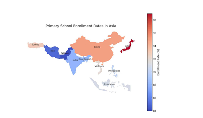
Primary school enrolment rates in Asian nations are depicted through this map chart, with varying colors signifying various percentages. Pakistan and Iran have lower enrolment percentages, ranging from 84 to 88%; India, Bangladesh, and Vietnam are in the middle range. China and Japan experience the highest enrolment rates, surpassing 96%. While some places may encounter obstacles to general primary schooling, the data indicates that developed nations have good educational access.
Sample 2
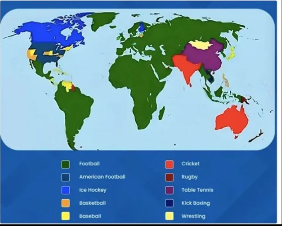
This map shows the spread of popular sports around the world. Starting with Football, the most popular sport in most of Europe, Africa, Asia, and South America is shown by green. Next comes cricket, which is highlighted in red and is the most popular sport in Australia and India. Ice hockey, which is very popular in North America and some parts of Northern Europe, is shown in blue. While rugby is popular in Australia and some areas of Europe, sports like American football and basketball are primarily found in North America. All things considered, the map clearly illustrates the regional and worldwide supremacy of several sports.
Sample 3
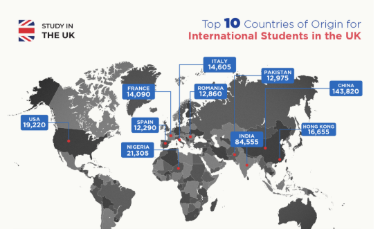
The map shows the top ten nations from which overseas students come to study in the UK. With 143,820 pupils, it identifies China as the top source, followed by India with 84,555. Other noteworthy nations are France (14,090), Italy (14,605), Romania (12,860), Pakistan (12,975), Nigeria (21,305), the USA (19,220), Hong Kong (16,655), and Spain (12,290).
Sample 4
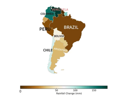
The map shows rainfall differences in South America, with varying shades telling quantities of rainfall. Starting with darker brown areas where the rainfall levels lower particularly in Brazil, Argentina, and Chile, whereas green tones suggest much more rainfall in Venezuela and Colombia. With the north having a wetter climate and the south having a drier one, the gradient illustrates regional climate variations. This trend points to geographic variables, the consequences of climate change, and regional differences in seasonal weather patterns throughout the continent.
Sample 5
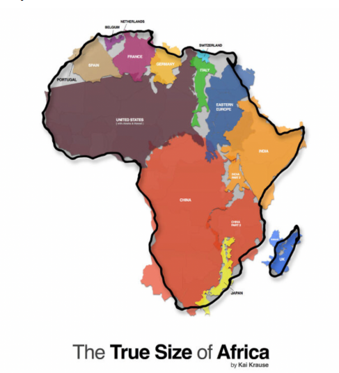
The map shows vast geographical scope of the African continent, which overlays several nations within its borders. It states that Africa is big enough to fit various nations, including US, China, India, Japan, and most of Europe, such France, Germany, Spain, Portugal, Italy, Switzerland, and the UK. Clearly, this map turns down the popular myths about Africa's size, which are frequently twisted by ambiguous map projections.
Tips to Score Maximum Marks in PTE Describe Image Question
Now that you have found the correct template and the latest samples, it's time to make the most of your preparation phase. Here are a few expert tips that will help you score maximum marks in the PTE describe image task.
- Use the Right Template: The first and most crucial tip is to use the original PTE Describe image template, which will save you time, given that the task is time-sensitive and you may run out of words. The right template ensures your response is precise and targeted.
- Start Responding at the Right Time: Beginning to respond at the correct time is crucial because you have 40 seconds to describe each image, which starts after the 25-second countdown. So, start responding once your response time starts and try to end it within 40 seconds.
- Take Effective Use of an Erasable Notepad: With the various types of questions, there will be a lot of information to note down in the section. You can use the notepad to note down some units or measurements mentioned in bar graphs and pie charts. This way, you can provide a detailed and accurate response.
- Practice Regularly: Consider this a universal fact, not just a tip, because practising regularly is the key to scoring well in the actual exam. Practising with a PTE mock test is of great help as you prepare in a simulated exam environment, which helps you master time management while working on areas for improvement. Moreover, you can enhance your preparation by enrolling in a PTE Online Coaching, where experts can guide you properly.
Enroll for the best PTE Coaching classes online and get desire score in your first Attempt
Book Free PTE Masterclass
Conclusion
Summing up, mastering the describe image PTE task depends entirely on your approach. Remember, aspects such as structure, speed, and confidence play a key role in your response. Just practice with the genuine PTE describe image template that helps you frame your response correctly without running out of thoughts.
The latest samples provided in this writing piece will help you master the various types of images in the task. Practice regularly to improve fluency and enhance time management, turning this into a real score booster.
0 comments

Practice Makes a Man Perfect!Take FREE pte Mock Tests
Start FREE Mock Test


Predict your PTE Score

98% students got exact PTE Score
What is your Target PTE Score?


Get Familiar with the Updated PTE Exam
Start Free Mock Test