PTE Describe Image 2026 – Templates, Examples & High-Scoring Tips
Last updated: Mar 24, 2026Are you struggling with the PTE describe image task of the speaking section? Many candidates face this task as a challenge because you are given a limited time to analyse and describe the image, which could be in the form of bar graphs, flow charts, pictures, etc. But with the right approach and following a describe image PTE template, you can turn this tricky task into a high-scoring one. This blog will help you understand the different types of images you may encounter, how scores are calculated in this task, and provide expert tips to follow while answering the questions.

Table of Contents
What is the PTE Describe Image Task?
The describe image task comes under the PTE speaking section, in which a candidate is shown an image that can be in the form of a bar graph, pie chart, table, diagram, map, or photo. Along with this, they have 25 seconds to analyse it, prepare the response, and then 40 seconds to answer it. The describe image PTE task tests a student’s ability to quickly interpret, analyse, and verbally express the contents of the image. This task follows a partial credit scoring method, which means that there are no correct or incorrect answers; your response will be evaluated on the basis of content, structure, fluency, vocabulary, and grammar. Below is the table which can help you structure your response and know what key points you should notice after the image is displayed on the screen, so let's have a look
|
Title |
It is located at the top of the image and should ideally be mentioned at the beginning of the answer. |
|
Distinctive Features |
Once the title is introduced, the candidate should move to the main features of the image. Try to include at least three components. |
|
Ending |
In the last, the answer with a conclusion that one has gathered from the image or a suggestion they would like to make. |
As you got an overview of what PTE describe image task is, and how much time is given to prepare and speak. Now, in the next section we will discuss the various types of images that you can encounter in your PTE exam.
Different Types of Images in PTE Describe Image Task?
In the PTE Describe Image task, you may encounter various types of images. Let’s explore some common types that can appear in the test.
- Bar Graph
- Line Graph
- Pie Chart
- Tables
- Process/Flow Chart
- Pictures
These are some of the various types of images that can be asked in your speaking portion. To get hands-on experience with such questions, you can try the Free PTE Mock Test by Gurully. Now, let’s understand each image type in detail along with their required samples and templates.
1. Bar Graph
In a bar graph, you will observe that some information or values of different things are displayed using rectangular bars. You can describe a bar graph with reference to the highest and lowest bars, overall trends, and whether there are any differences or similarities among the categories. To answer the bar graph, one needs a structured approach. For more clarification on how to answer, look at the template for the Bar Graph.
PTE Describe Image Template: Bar Graph
Introduction: The graph depicts the trends in (subject) over (period).
Body: The (subject) shows a significant increase from (start year) to (end year), reaching its peak at (highest point). In contrast, there was a remarkable decline from (highest point) to (lowest point). The data also shows a moderate variation between (year) and (year).
Conclusion: Overall, the graph demonstrates the changing patterns of (subject) over the given period.
Bar Graph PTE Sample - 1
Let’s have a look at the PTE image of the Bar Graph that is given below and then read the sample answer for the same.

Answer:
The chart shows that 72% of the people preferred their vehicles, followed by 17% who chose to walk to reach their chosen destination. Public transportation like trains, buses, and ferries was used by 10% of individuals, and only 2% of people chose other forms of transportation.
Overall, we can conclude from the chart that people in Sydney find much more comfort in traveling in their vehicles for trips as compared to other conveyances.
Bar Graph PTE Sample - 2
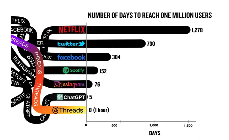
In the given bar graph, the time taken by various online platforms to reach one million users is shown. Starting with Netflix, which took the longest 1,278 days, followed by Facebook with 304 days, and Twitter with 730 days. Social media giant Instagram took only 76 days to reach the milestone, while Spotify did it in 152 days. Counting in ChatGPT, which reached one million users in just five days. Among all, Threads experienced the fastest growth, reaching one million users in zero days, basically, in just one hour. The information provides a clear overview of how quickly emerging platforms may amass sizable user bases.
Bar Graph PTE Sample - 3
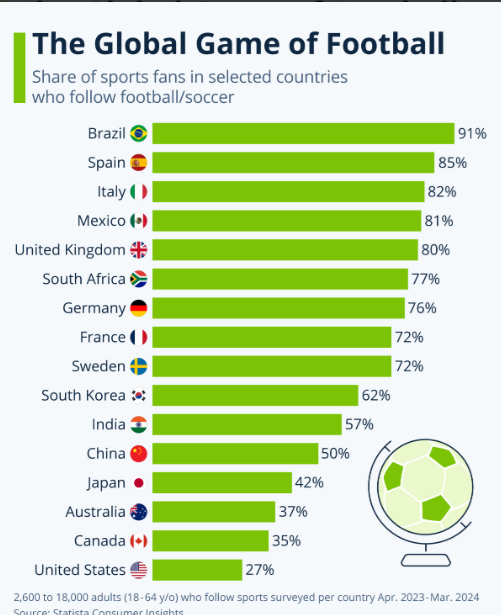
According to a survey conducted between April 2023 and March 2024, the proportion of sports supporters in a few selected countries who watch football is displayed in this bar chart. Football is the most popular sport in Brazil (91%), followed by Spain (85%) and Italy (82%). At 80% and 81%, respectively, the United Kingdom and Mexico likewise have significant levels of engagement. The United States, on the other hand, has the smallest number of football supporters (27%). Other nations with moderate degrees of interest include China, Japan, and Australia
Bar Graph PTE Sample - 4
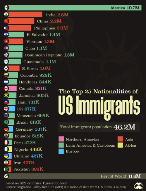
This bar chart specifies the 25 predominant nations of immigrants in the USA, according to 2022 projections. Having 10.7 million immigrants, Mexico is the largest country, followed by China (2.2 million), India (2.8 million), and the Philippines (2.0 million). With more than a million immigrants each, El Salvador, Vietnam, Cuba, South Korea, Guatemala, and the Dominican Republic are other important countries. Three European nations, the UK, Germany, and Ukraine, are also listed in the graph as major immigration destinations to the United States. According to the figures, there are 46.2 million immigrants overall, including 11.6 million of them falling under the "Rest of World" category.
Bar Graph PTE Sample - 5
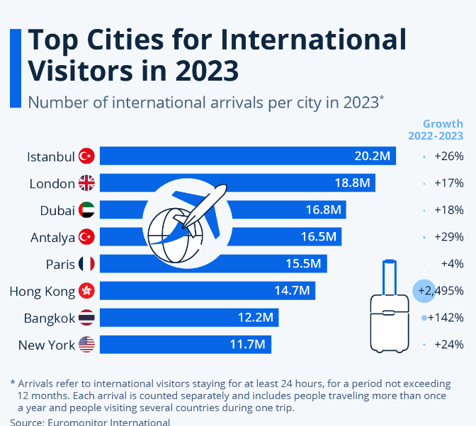
The most popular destinations for foreign visitors in 2023 are shown in this bar graph, along with the total number of foreign visitors in each city and the growth rates between 2022 and 2023. Starting with Istanbul, the capital of Turkey, has seen a rise of 26 per cent in visitors, with 20.2 million. Moving further, London has welcomed 18.8 million guests and seen a growth of 17%. Followed by Dubai and Antalya, which have visitors almost in the same numbers, 16.8 and 16.5, respectively, with a growth of 18% and 29%. Moreover, Paris has witnessed the lowest growth rate, 4% with 15.5 million visitors, while Hong Kong has experienced a massive growth of 2495%, with visitors reaching 14.7 million. Lastly, the bar graph includes Bangkok and New York with 12.2 and 11.7 million visitors, respectively. In 2023, Bangkok has seen a growth of 142% while New York has seen a growth of 24%.


2. Line Graph
A line graph represents how the data changes over a period of time using lines that connect data points, highlighting trends like increases, decreases, and fluctuations. The horizontal axis usually represents time, while the vertical axis shows the values being measured.
PTE Describe Image Template: Line Graph
Introduction: The line chart describes information (Topic/Title)
Body: The highest figure in (Name) is at (Figure), and it gradually declined/increased to reach a low/high of (Figure). On the contrary, the lowest figure in (Name) is at (Figure), and it gradually rises/drops to (Figure).
Conclusion: In conclusion, it can be seen that (Trend/Highest/Lowest/Difference/Similarity).
Line Graph PTE Sample - 1
Given below is a sample for a Line Graph that will help you to know how to describe it, understand the type, and format for your exam.

Answer:
This line graph or chart indicates Dubai Gold Sales in 2002 throughout the year measured in millions of dirhams.
In January, the price was at 200 dirhams. It saw a sharp rise from February, reaching 350 million. Additionally, there was a sharp decline, followed by a slower decrease, ultimately resolving at 150 million in July. As we see, August marked a brief recovery, with sales hitting 200 million, followed by another decline in September. However, by December, sales again returned to 200 million.
In conclusion, in the whole year, there were changes, but on the whole, sales remained at approximately 200 million dirhams per month.
Line Graph PTE Sample - 2
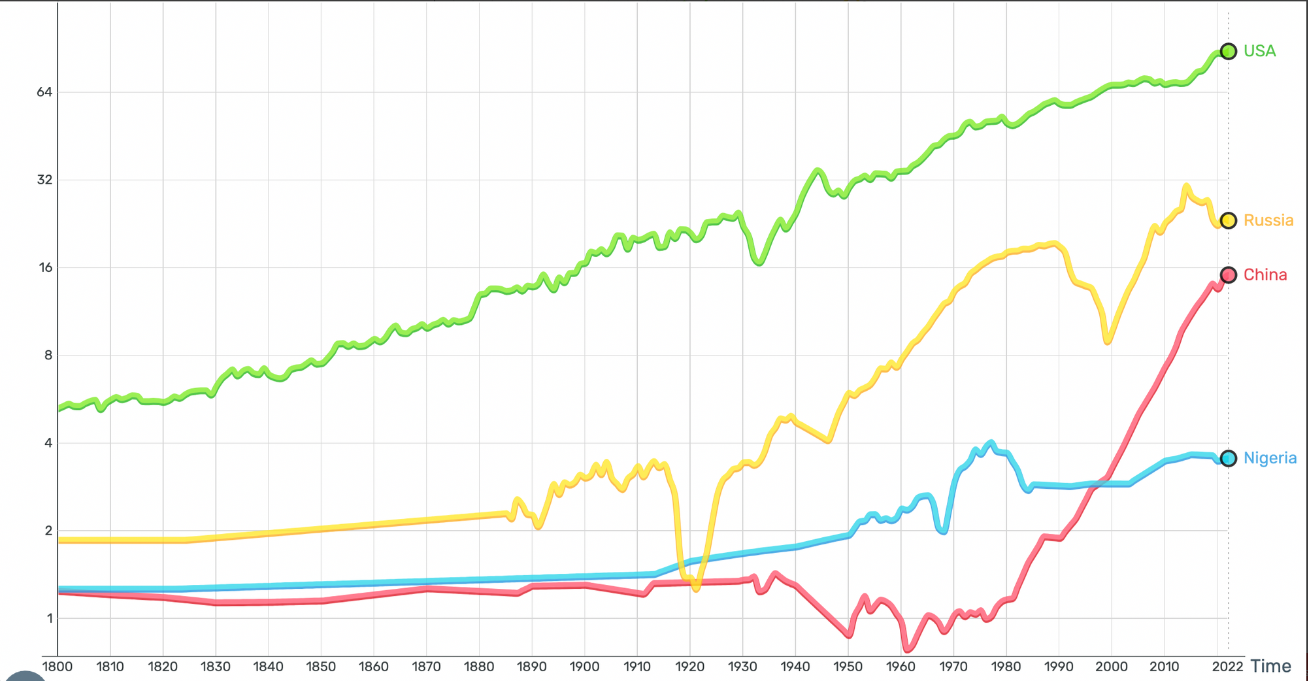
This line graph displays the average daily earnings for each country, including the United States, China, Russia, and Nigeria, in USD from 1800 to 2022. The average daily earnings in the USA, represented by the green line, have steadily increased and reached their highest point in 2022. Russia, represented by the yellow line, shows varying income levels with noticeable declines at the beginning of the twentieth century; however, overall growth continues through 2022. The red line represents China's income, which rises sharply after 1970, particularly towards 2022. Nigeria's income growth is depicted by the blue line as being slower and lower, with minor variations over time and a general decline since the year 1980.
Line Graph PTE Sample - 3
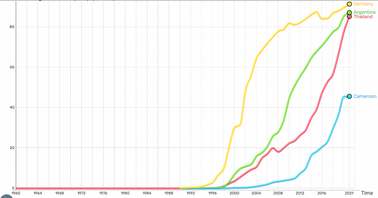
From 1960 to about 2021, the line graph illustrates the proportion of people in nations such as Germany, Argentina, Thailand, and Cameroon who use the internet. The final years of the 1990s witnessed a sharp increase in internet use in Germany, Argentina, and Thailand. By 2021, all three nations had achieved widespread usage rates of more than 80%. The fastest rise is seen in Germany, which is swiftly followed by Thailand and Argentina, suggesting that internet use is widespread. Differences in internet access are highlighted by Cameroon, which displays a slower rise in usage and a significantly lower acceptance rate, reaching just over 40% by 2021.
Line Graph PTE Sample - 4
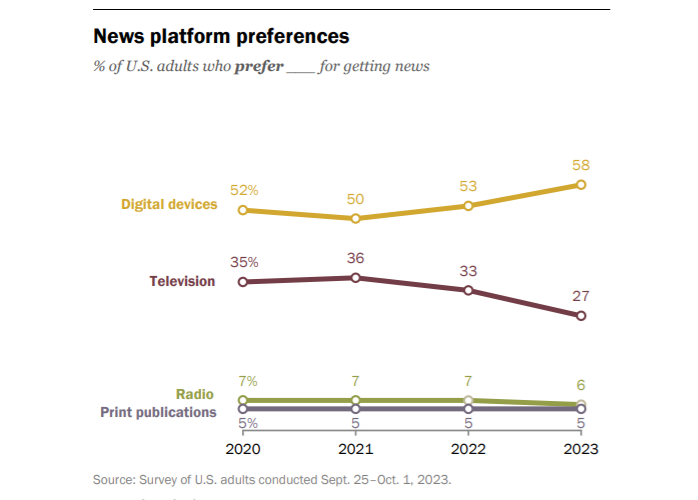
The usage habits of American adults for various news media between 2020 and 2023 are shown through this multi-line graph. From 52% in 2020 to 58% in 2023, this demonstrates a significant rise in consumer preference for digital devices. Moreover, the preference for television fell from 35% to 27% during this time. The use of both print publications and radio stayed low but relatively unchanged, with print staying at 5% and radio declining from 7% to 6%.
Line Graph PTE Sample - 5
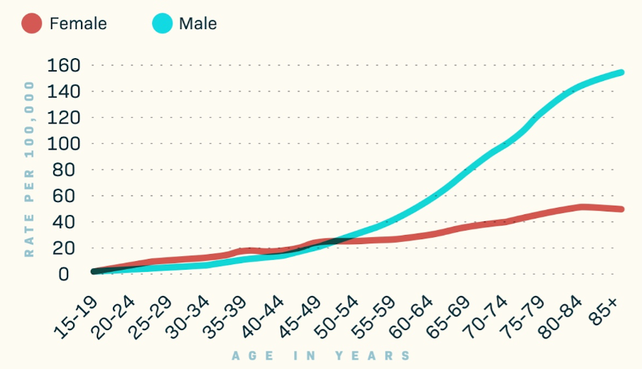
The occurrence rates of skin cancer in the US by age and gender are shown in this line graph. The rate of cancer rises with age in both males and females. As per the data, the occurrence of cancer is consistently higher in men than in women, and this difference is especially seen in older age groups. Moreover, the graph shows that the age range of 55–59 is where the cancer rates for the male population begin to vary significantly from those for females.
Explore PTE Vocabulary List
3. Pie Chart
A pie chart depicts data as parts of a whole that show how different categories comprise a whole. It's a circular graph split into segments, each segment representing a percentage or portion of that category. Pie charts show differences and allow easy comparisons of which categories are larger and smaller in relation to each other.
PTE Describe Image Template: Pie Chart
Introduction: The pie chart illustrates the distribution of (category) in (context).
Body: The largest portion of the pie chart is assigned to (category 1), consisting of (percentage). Meanwhile, (category 2) and (category 3) represent (percentage) and (percentage) of the chart, respectively.
Conclusion: In conclusion, the pie chart provides a clear overview of the distribution of (category) in (context).
Pie Chart PTE Sample - 1
Here is a sample of a PTE describe image line graph that will help you understand how data trends change over time and how to describe them effectively in the PTE test.

Answer:
The pie chart here represents the survey conducted by a man on 30 kids to know which pet they like the most.
It illustrates that 53.33% of them like dogs, which is the maximum number among all the other categories. Cats are favoured by 6.67% of the students, while the same percentage, 6.67%, express a liking for hamsters as pets. 6.67% of students said that they like other pets apart from dogs, cats, and hamsters, and 26.67% of students said that they like all pets.
In conclusion, the maximum percentage of liking is for the dogs.
Pie Chart PTE Sample - 2
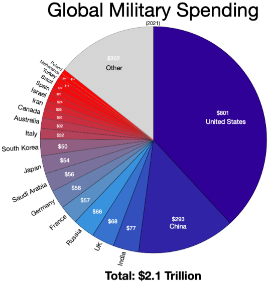
The $2.1 trillion worldwide spending for military in 2021 is shown in this pie chart. The largest contributor, the United States, spends $801 billion, substantially greater compared to any other nation. China comes in second with a spending of $293 billion. Russia ($66 billion), France ($57 billion), the UK ($68 billion), and India ($77 billion) are other significant spenders. With expenditures ranging from $50 to $57 billion, nations like South Korea, Japan, Germany, and Saudi Arabia are also included. The $302 billion in the "Other" section represents the aggregate spending of many other nations. The difference in military spending between the United States and the rest of the globe is highlighted by this graphic.
Pie Chart PTE Sample - 3
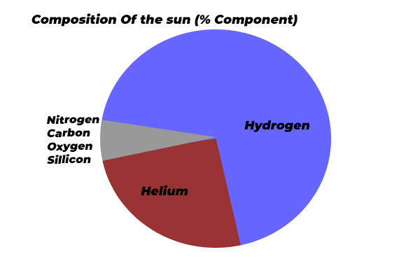
The proportion of the sun's components is displayed in the pie chart. According to the chart, hydrogen and helium are the components that make up the largest proportions of the sun's gas. Apart from that, components such as carbon, oxygen, silicon, and nitrogen are also found in extremely small amounts. Overall, hydrogen and helium can be considered the sun's main components.
Pie Chart PTE Sample - 4
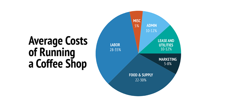
The costs associated with operating a coffee shop are broken down in the pie chart. Labour accounts for 28–35% of total costs, with food and supply costs coming in second at 22–30%. Approximately 10–12% goes into lease, utility, and office expenses, whereas 5–8% goes towards marketing. 5% is made up of miscellaneous expenses. According to the data, the two biggest expenses associated with running a coffee business are personnel and stock.
Pie Chart PTE Sample - 5
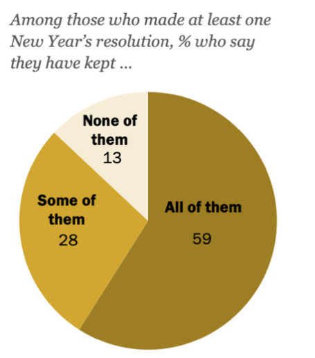
This pie chart illustrates the progress of American adults with their New Year's resolutions, as reported in a January 2024 study. Among those who made at least one resolution, 59% reported keeping all of them, while 28% said they had followed through on some. Lastly, 13% of the respondents said that they had broken their resolutions. Overall, this data shows that the group surveyed has dedicatedly followed New Year's resolutions.
4. Tables
Another common image type in PTE Describe Image task is a table. In this type, it is not necessary to describe all of the figures in the table. Instead, it is vital to find out the relative figures or trends first and simply mention the elements provided in the chart. Look at the template for tables.
PTE Describe Image Template: Tables
Introduction: The table presents the data related to (topic).
Body: (Category 1) observes a rise from (value) in (year) to (value) in (year). On the contrary, (Category 2) had a gradual decline from (value) in (year) to (value) in (year). (Category 3) remained steadily stable throughout the period, floating around (value).
Conclusion: In summary, the table highlights the various trends and figures for (topic).
PTE Tables Sample - 1
The table shown below for depicts the percentage of students with study issues in two universities. Look at the image below.

Answer:
The table displays the percentage of students with several academic problems in the two universities a decade ago compared with the current one.
The number of students with problems attending lectures rose drastically from 18 to 32% in University A, whereas it remained at 15% to 16% in University B. University A saw a deduction in the number of students having issues with submitting tasks on time, from 28% to 18%, while this increased from 13 to 19% for University B. Finally, University A had 24% of students with problems concentrating in lectures, compared with 18% in University B, and this did not change over the time.
In conclusion, the two universities had noteworthy differences in study-related challenges, with some improving over the last decade while others weakened.
PTE Tables Sample - 2
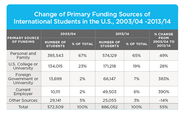
The table includes data on the primary financing sources for international students in the United States from 2003–04 to 2013–14. Funding primarily from family and personal sources has increased by 49%, reflecting the rise in the number of international students. Moreover, funding from U.S. colleges and universities increased by 28%. Among all, the biggest increases were from foreign governments and existing companies, which increased by 383% and 390%, respectively. Lastly, funding from other sources is expected to decrease by 14%. Above, during this time period, the 2013/14 academic year witnessed a 55% increase in international students compared to 2003/2004.
PTE Tables Sample - 3
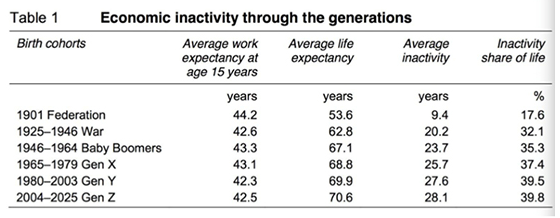
The percentage of life that each generation spends in the economy from 1901 to 2025 is presented in the table below. The data displays that individuals in 1901 worked for 44.2 years and were sedentary for just 17.6% of their entire lives. Moreover, the average lifespan rose sharply from 53.6 years in 1901 to 70 years in 2025. Above all, with the available data, it can be said that younger generations tend to become more inactive, with Generation Z and Y said to remain sedentary for 40% of their lives.
PTE Tables Sample - 4
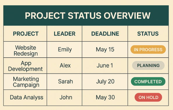
The table below showcases four business projects, including their reporting managers, due dates, and current status. Starting with the website redesign, which Emily is in charge of, needs to be completed by May 15. Furthermore, Alex is responsible for app development, which is currently in the planning stage with a due date of June 1. The marketing campaign led by Sarah is now complete; however, John's data analysis project, due on May 30, is currently on hold. Above all, the table displays an overview of the timetable and status of each project.
PTE Tables Sample - 5
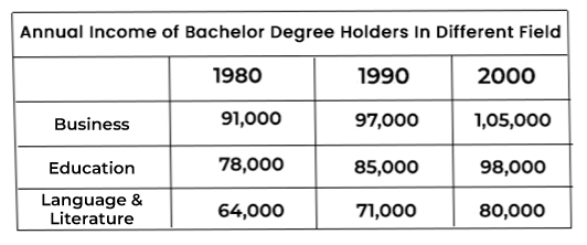
The yearly income of those with bachelor's degrees in business, education, language, and literature streams is shown in the table. Students who graduated from the business stream earned good money in each of the three years, with incomes ranging from $91,000 in 1980, $97,000 in 1990, and $105,000 in 2000. Comparatively, the range of wages for graduates in language and literature was $64,000 in 1980, $71,000 in 1990, and $80,000 in 2000. Apart from these two, those with degrees in education earn a medium salary, notably $ 78,000 in 1980, $ 85,000 in 1990, and $ 98,000 in 2000.
Explore PTE Collocation List
5. Process/Flow Chart
In Process/Flow charts or diagrams, the candidate is required to describe a process in chronological order. Therefore, candidates must have a strong vocabulary for the process diagram. This task sometimes gets tricky as there are too many or too few processes to describe in 40 seconds. In addition, look at the template below.
PTE Describe Image Template: Process/Flow Chart
Introduction: The process/flow chart image gives the process or life cycle of (Topic/Title).
Body: There are several stages /steps in the flow chart. Initially explain (The first process). And in the next stage, convert into the (second process), and then the (third process).
Conclusion: Finally, (The final process) and provides information about (Topic/Title).
PTE Process / Flow Chart Sample - 1
Below is the sample picture for the PTE Process/Flow chart that can come in your exam. Have a look for a better understanding.

Answer:
The image shows the Inquiry Process and Terms of Reference for Australia in 2015.
This process begins with the Terms of Reference and ends with the Government’s response. Initially, it involves early research and consultations, followed by the creation of issues paper, and a call for submissions. Eventually, there is an examination of the collected submissions that leads to the generation of a Discussion Paper. After review and further consultations, a final report is made.
In conclusion, the report is then submitted to the government, which results in a response involving possible law-making changes.
PTE Process / Flow Chart Sample - 2
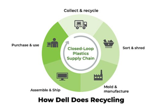
This figure illustrates Dell's recycling procedure using a closed-loop plastics supply chain. The process begins with the collection and recycling of products, which are then dispatched for classification and shredding. The components are then molded and produced at the facility. Next, every component of the computer is put together and prepared for shipping. At last, Dell PCs are available for purchase. In general, there are five primary steps in the recycling process.
PTE Process / Flow Chart Sample - 3
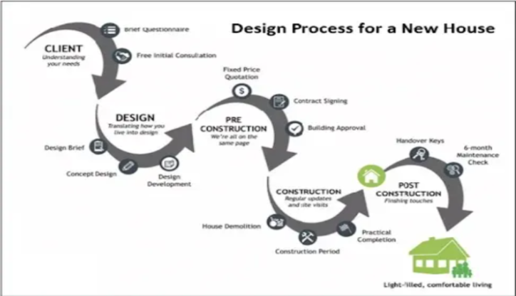
The given flowchart provides details on the process of planning and building a new house. It starts with the client completing a questionnaire and having an initial discussion about preliminary ideas. Furthermore, the design phase focuses on developing the concept, which is crucial for the pre-construction phase, where agreements, permissions, and pricing are finalised. Once everything is decided, the construction phase begins according to the estimated schedule. Lastly, after the thorough maintenance check, the key to the newly constructed home is handed over.
PTE Process / Flow Chart Sample - 4
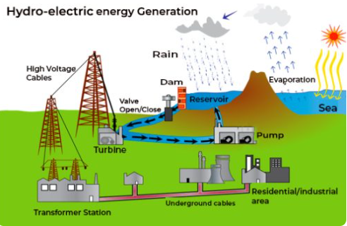
This is the entire process of producing hydroelectric electricity, which begins through the evaporation of water and continues through the gathering of rainfall in dams and reservoirs. The electricity is then produced with the aid of a pump and turbine and delivered to the transformer facilities via powerful wires. Lastly, hydroelectric energy is delivered to the industrial and housing sectors via subterranean lines. The process of generating electricity from seawater involves several steps.
PTE Process / Flow Chart Sample - 5
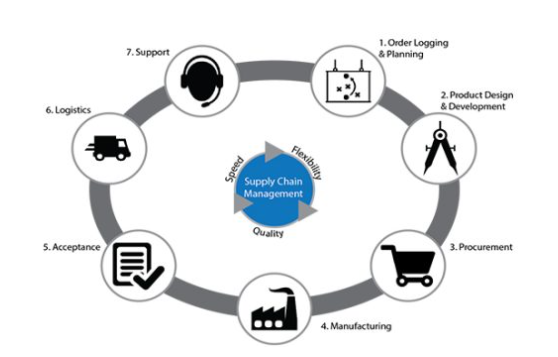
Through this flowchart, the supply chain management process is illustrated in terms of quality, speed, and flexibility. Order planning and logging, along with product design and development, are the initial steps. Additionally, a manufactured product must be delivered via logistics when the order is received. Lastly, the final step includes offering support to the advertised product.
6. Pictures
In this, an image will be shown to you representing any information, and you have to observe the photo during the 25-second preparation time. You must keep your eye on key elements, people, objects, and the overall scene. Let’s look at the template that you can use in this task.
PTE Describe Image Template: Pictures
Introduction: The photo captures a scene of (description).
Body: The foreground of the photo portrays (main objects/people) engaging in (activity). In the background, add the (additional details), that can be observed, contributing to the overall atmosphere.
Conclusion: Overall, the photo lively depicts (description), capturing the moment’s essence.
PTE Describe Image Pictures Sample - 1
The image or picture given below shows a person crossing the road. See the image and read the sample answer for the same.

Answer:
The given image shows a young girl who is crossing the road, and it seems like she is busy on her phone.
The highlight of the image, which I can observe is that she is not aware of anything and is busy looking at her phone while crossing the road. There is no other person around her, that is why she can cross the road very smoothly. In the background, I can only see some cars and trees.
Overall, I can conclude from the image that the person knows her destination and where she has to go after crossing the road.
PTE Describe Image Pictures Sample - 2
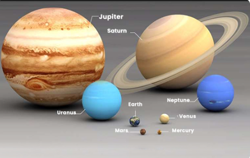
This picture provides details on the solar system. Jupiter serves as the largest planet, as can be recognised by its brown shade. Followed by Saturn, the second-largest planet, which is displayed by brown colour and has rings surrounding it. Lastly, there are many multiple small planets with Mercury being the smallest one, and it is followed by Mars, Earth, Venus, Uranus, and Neptune.
PTE Describe Image Pictures Sample - 3
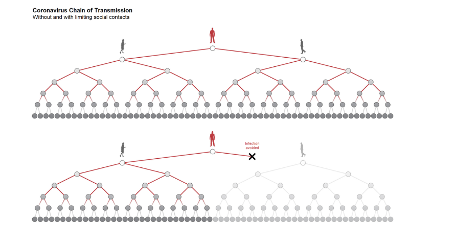
The picture shows how restricting social interactions can affect the spread of the coronavirus. The upper half depicts an unrestricted situation in which a single sick person starts a broad and growing chain of transmission that infects a large number of people. In the bottom half, a situation with few social contacts is depicted, which greatly slows the virus's transmission. Important areas are shown where possible transmissions are prevented as a result of these actions, clearly demonstrating a decrease in the number of afflicted people.
PTE Describe Image Pictures Sample - 4

The given image displays a row of attractive houses filled with various colors, built along a fine water canal. Each of these houses has bright colors including, pink, yellow, orange, and blue, making a lively and vibrant atmosphere. This scene looks peaceful and well upheld, given the flowers hanging from balconies that are adding appeal. Overall, the picture shows a calm town with exceptional construction and pretty beauty.
PTE Describe Image Pictures Sample - 5
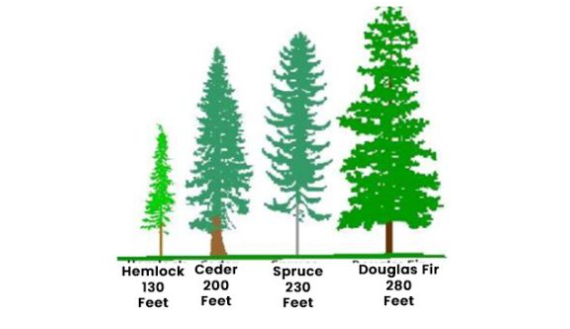
The image shows four distinct trees' heights in feet, with the Douglas fir being the tallest tree, standing at 280 feet. Moving ahead, spruce and cedar are next tallest trees with height at 230 and 200 feet, respectively. Lastly, Hemlock is at 130 feet tall, the shortest in all.
Finally, these are some of the types of PTE charts or Describe Images that you can face in your PTE exam. Now, let’s discuss in the next section what is the scoring criteria, and how your answers will be assessed in the exam.
Download Now: PTE Speaking Practice Tests PDF
Scoring Criteria for Describe Image PTE Task
In the PTE Describe Image task, accuracy is important. Candidates are evaluated on how accurately and thoroughly they can describe the image. It includes mentioning the key elements, a correlation between data points, and conclusions that can be drawn. Thus, the described image task will be assessed based on the three criteria that are given below.
Content
Content signifies the information that you record in your response. You should describe all the information from the given image. Thus, a well-structured response in the writing or speaking section must include:
- All aspects of the image.
- Logical connections between the points.
- Conclusions based on the image.
Oral Fluency
It is a vital component of the scoring criteria. It refers to the smoothness, effortlessness, and natural tone of speech. Key aspects of oral fluency include:
- Rhythm, phrasing, and stress.
- Avoid hesitations, repetitions, and false starts.
- Maintain a stable and normal pace of speaking.
Pronunciation
The answers you write for the PTE describe image are scored based on how easily your content is readable. Elements of good pronunciation involve:
- Clear usage of vowels and consonants.
- Correct stress and intonation.
- There should be clarity to the speaker.
In essence, this is the criterion for how the PTE scores are assessed by an examiner. Now, the next part includes the scoring specifics or the points allocation for each criterion.
Points Allocation for Each Criterion in PTE Describe Image
The Describe Image task allocates points for each scoring criterion. Let’s have a look at the table given below.
Scoring Breakdown for PTE Describe Image Task:
| Criterion | Maximum Points | Key Considerations |
|---|---|---|
| Content | 5 | Completeness, logic, and implications |
| Oral Fluency | 5 | Smoothness, natural tone, no hesitations |
| Pronunciation | 5 | Clarity, stress, and intonation |
This is the scoring breakdown or the point allocation for the answers to the PTE describe image. According to this, your answers will be scored. Now, the next section covers some tips and tricks to excel in the task of describing an Image in the PTE test.


Tips and Tricks for the PTE Describe Image Task
Tips and tricks play a crucial role in the describe image task of the speaking section or overall in the PTE Academic exam. Mentioned below are some of the tips that will help you to ace this task.
- Don’t Stop: The Speaking Test assesses your verbal ability to express. So, even if you face difficulty in understanding an image, speak as much as you can.
- Understand the Pattern: If you are doing PTE exam preparation, then it is important to understand the PTE exam pattern and get familiar with what the Describe Image task wants.
- Avoid Fillers: Umms...and urrs... are strictly avoided as the machine will take them as a lack of preparation and vocabulary.
- Highlight the Main Points: It is important to highlight the main points by scanning the information given in the chart/graph/image. Plan your sentences accordingly.
- Develop a Strategy: The PTE exam syllabus needs a specific strategy for the tasks. Templates can be helpful in solving the task of describing an Image.
- Understand the Image Type: Different images require different approaches. Thus, get familiar with all the different types of PTE charts, such as bar graphs, line graphs, and pictures.
Explore Different Types of PTE Speaking Questions:
- Personal Introduction
- Read Aloud
- Repeat Sentence
- Retell Lecture
- Answer Short Questions
- Summarize Group Discussion
- Respond to a Situation
Final Thoughts
To sum up, the PTE Describe Image task evaluates your descriptive, analytical skills and how well you can describe the different images. Thus, this blog covers the different types of images that you can encounter, with their templates and sample answers. Additionally, the scoring criteria and tips have also been provided for scoring high in the test. Still, if you are facing difficulties in your PTE preparation, then you can practice with our PTE free mock test of all the sections. You can also join our online PTE classes and get free study abroad consultancy to complete your journey.
0 comments

Practice Makes a Man Perfect!Take FREE pte Mock Tests
Start FREE Mock Test


Predict your PTE Score

98% students got exact PTE Score
What is your Target PTE Score?


Get Familiar with the Updated PTE Exam
Start Free Mock Test