IELTS Academic Task 1 Line Topics 2026 | Graph Structure, Samples & Tips
Last updated: Dec 30, 2025Did you know that line graph task 1 in IELTS writing can significantly impact your overall performance in the IELTS exam? This is especially true for areas like Task Achievement, Coherence and Cohesion, and Lexical Resources in IELTS Writing Task 1. To help you, in this blog, we have listed some samples of IELTS task 1 line graphs along with their model answers. Additionally, you will also find an effective way to answer line graph questions to help you get band 9 in your IELTS exam!

Table of Contents
Introduction to IELTS Writing Line Graph Task 1
In the IELTS academic, line graphs are a common chart type, which you will be asked to describe in the writing task 1. This chart type is commonly used to assess your ability to understand and process information.
Here, you will be asked to describe, summarize, and compare the information in the line graph. The graph will have two axes, mainly X for the horizontal axis and Y for the vertical axis, which will represent the time and value of a specific entity or variable.
It is typically recommended that you spend no more than 20 minutes completing line graph task 1 and write more than 150 words. To help you answer this task effectively and improve your chances of getting a band score of 9 in IELTS, below is an expert way to structure and answer the writing task 1 line graph that you can follow.
Also Read: Bar Graph Task 1
 Take Writing Mock Test Now!
Structure to Write an Academic IELTS Line Chart Task 1
The primary thing that is being tested in the IELTS writing task 1 line graph is how well you can identify the key feature of the visual and present it in a summary. However, at times, you will also need to compare the data.
The basic structure that one must follow to answer a line graph correctly is to include:
- Introduction
- Overview
- 1st main feature
- 2nd main feature
In addition to this structure, you should first analyse the IELTS writing task 1 and then formulate your answer. Let’s look at an example to help you understand how to structure these answers correctly:
Step 1: Analysing the Task
The first step in answering any line graph IELTS is analysing the task. This is an important part because it will ensure you follow the right track. One great way to understand this task is to answer five basic questions. These include:
1. What does the graph show?
2. Where was the graph's data collected?
3. How many factors are included in the graph?
4. What period does the graph's data come from?
5. Are there any noticeable similarities?
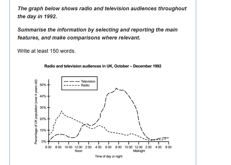
The example above has two main features. The first is that the peak time for the television audience is 8 pm, whereas for the radio audience, it is 8 am. This information will give you a brief idea about how you should write the introduction for line chart task 1 effectively and the tense you need to use.
Step 2: Writing the Introduction
The best way to write the introduction for your IELTS writing task 1 is simply to paraphrase the question. You can do this by using synonymous phrases and sometimes antonyms. In addition to this, you can also restructure your question. For example:
For the Question Above: The graph below shows radio and television audiences throughout the day in 1992.
Introduction: The line graph illustrates the number of people tuning in to radio and television programs at various times throughout the day in the year 1992.
Your introduction doesn't need to be intensive; it should just briefly describe the question.
Step 3: Writing the Overview
The next step in answering your line graph task 1 for IELTS is writing an overview. Here, you need to identify the two key features of the line graph that will help you write a general sentence.
In your overview, you should also mention any comparisons in the graph. Another thing you should add to your overview is whether the lines are increasing, decreasing, or stable.
Additionally, you should write 1-2 sentences describing the key features. Make sure that you use introductory phrases like "Looking at the chart…" and connectors such as "In addition" or "Furthermore."
For example, the graph clearly shows that television audiences peak at 8 pm, while radio audiences peak at 8 am. Furthermore, these contrasting peak times reflect distinct audiences
habits for each medium.
Step 4: Writing 1st Main Feature
Once you have written an introduction and an overview for the task 1 line graph, you need to write about the first main feature in detail. Make sure to provide evidence to support the feature and make any relevant comparisons.
For example, our 1st main feature is that the peak time for TV audiences is 8 pm. To explain this, you can write the third paragraph like:
Fewer than 10% of individuals tuned in to television from 1 am to 12 noon. However, by 4 pm, this number rose sharply, peaking at nearly half the population at 8 pm. Following this, the viewership dropped quickly, reaching a minimal percentage by 3 am.
Step 5: Writing 2nd Main Feature
Similar to the fourth step, here you need to explain the 2nd main feature. In our example above, the 2nd main feature is that the peak time for radio audiences is 8 am. You can write and compare this as:
In contrast, radio demonstrates a distinct pattern. Its peak listening time occurred shortly after 8 am, with approximately 27% of the population tuned in. After this high point, the audience steadily decreased to around 2%, aside from minor fluctuations near 4 pm and 10:30 pm. Overnight, the percentage of listeners remained low, only to rise sharply from 6 am, reaching its morning peak by 8 am.
IELTS Writing Task 1 Line Graph Sample Answer
To help you better understand how to write answers for line graphs in IELTS writing task one. Below are a few line graph examples along with sample answers to get the band score of 9. During your IELTS preparation, you can take these answers as your reference while solving line graph questions.
Check out these samples below:
Writing Task 1 Line Graph Sample 1
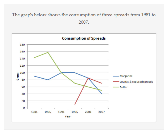
Below is an example of a line chart task 1, which talks about the consumption of three spreads. You will see three lines denoting each spread. However, one thing that stands out here is that one of the spreads has no data for the first few years. To boost your IELTS score, you can write an answer to this question:
Sample Answer:
Introduction: The line graph depicts the consumption of three types of spreads: margarine, butter, and low-fat and reduced spreads from 1981 to 2007. The figures are presented in grams.
Overview: The consumption of margarine and butter declined significantly throughout the period. On the other hand, the usage of low-fat and reduced spreads rose steadily. At the beginning of the period, butter was the most commonly consumed spread. Midway through, margarine became the most popular choice, but by the end, low-fat and reduced spreads overtook both.
1st Main Feature: Butter consumption started at approximately 140 grams in 1981, peaked at 160 grams in 1986, and then witnessed a sharp decline, reaching around 50 grams in 2007. Similarly, margarine consumption, which began at roughly 90 grams, fluctuated slightly before falling to a low of about 40 grams by the final year.
2nd Main Feature: On the other hand, low-fat and reduced spreads entered the market in 1996 at about 10 grams and grew rapidly to over 80 grams by 2001. Despite a slight dip in subsequent years, the consumption remained relatively high, closing at around 70 grams in 2007.
Writing Task 1 Line Graph Sample 2
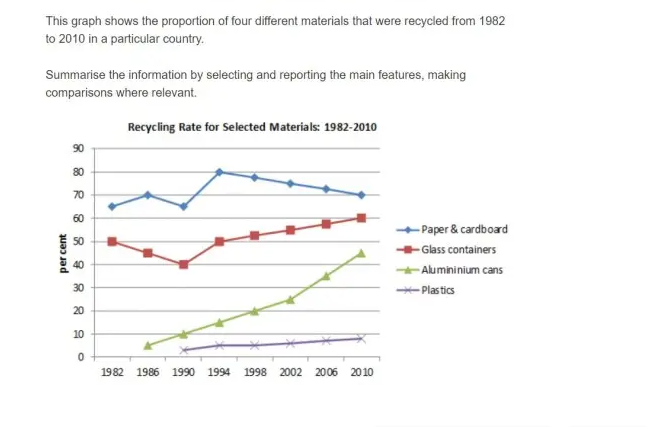
In our next line graph IELTS sample, you will see four lines denoting different materials. On the X axis, there are several years, whereas on the Y axis, you will see the percentage. You can answer this question as:
Sample Answer:
Introduction: This line graph illustrates the recycling rates of four materials: paper and cardboard, glass containers, aluminium cans, and plastics over 28 years from 1982 to 2010.
Overview: All four of these materials showed an upward trend in recycling rates. Paper and cardboard consistently recorded the highest percentages despite fluctuations, while aluminium cans demonstrated the most substantial growth. In contrast, plastic remained the least recycled material throughout the period.
1st Main Feature: The recycling rate of paper and cardboard began at approximately 66% in 1982, peaked at 80% in 1994, and then declined slightly to 70% by 2010. The recycling rate of glass containers fluctuated, starting at 50%, dipping to 35% in 1990, and steadily rising to above 50% by the end of the period.
2nd Main Feature: On the other hand, aluminium cans exhibited significant growth, starting at 5% in 1982 and rising to 40% by 2010. However, plastic recycling showed minimal progress, increasing from below 10% to a mere 10% by 2010.
Writing Task 1 Line Graph Sample 3
Our last sample for line graph task 1 is a great example of a graph where most students get confused because of a lack of information. You can answer these questions by focusing on detailed comparisons and making your answers data-intensive.
Sample Answer:
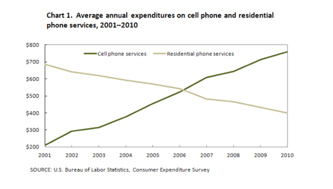
Introduction: The line graph compares the average annual expenditure of American consumers on mobile and residential phone services over ten years.
Overview: The spending on mobile phone services rose significantly, whereas expenditure on residential phone services declined dramatically throughout the decade. Notably, both services recorded identical levels of expenditure in 2006.
1st Main Feature: In 2001, average annual spending on mobile phone services stood at merely $200, compared to approximately $700 for residential phone services. Over the next five years, mobile service expenditure saw a steady increase, reaching just over $500 in 2005, while spending on landline services gradually fell to below $600.
2nd Main Feature: By 2006, the two services achieved equal expenditure levels at around $550. Following this, spending on mobile services surged, peaking at approximately $750 in 2010, nearly quadrupling its initial figure in 2001. In contrast, expenditure on residential phone services continued to decline sharply, especially after 2007, reaching its lowest point by the end of the period.
Also Read: IELTS Map Task 1: Sample Q&A, Essential Tips, & More
Tips to Excel in IELTS Writing Line Graph Task 1
Line graphs are a very common task in the IELTS exam. The topics vary for each chart, as each one represents different types of information over different periods. Moreover, the exam pattern of the IELTS writing section is designed to test a candidate’s ability to present their viewpoint or argument. Thus, in this section, the tips are covered that can help you ace the line graph in the writing portion.
- Candidates must be able to identify keywords, patterns, and fluctuations presented in the graph.
- Use paragraphs to explore different aspects of the graph, keeping things clear and easy to follow.
- Showcase your vocabulary and grammar appropriately.
- Look for points of comparison and contrast within the graph.
- Put numbers or percentages to support your sentences in the body paragraph.
- Don’t merge your points into separate paragraphs. You should make sure to include the main increases and decreases shown in the graph.
- Avoid using words like from...to.... for the amounts; use “it increases by double, which shows the difference.
- Try not to spend more than 20 minutes on task 1. You will need 40 minutes in writing task 2 topics.
- Aim for about 160-190 words. Don’t write under the word count.
- If the line graph includes many lines and a lot of movement, be selective. You will be evaluated on your ability to select key features.
- Take the time to proofread and revise your writing. Check for grammar, spelling, and punctuation.
- Clarity and Conciseness are key to ace the IELTS writing task 1, so maintain them.
Finally, these are some of the useful tips that students can apply to excel in the line chart of the writing portion. These tips will help you to achieve a good score. Thus, candidates who want to go abroad and aim to take the IELTS exam must check the IELTS syllabus for all four sections on our website.

Conclusion
And there you have it: line graph examples along with sample answers. Line graph task 1 might seem like a difficult part of the IELTS writing section. However, you can follow the structure above to write a cohesive answer that’ll surely get you a band score of 9.
Additionally, if you need tailored help in not just line graphs, but IELTS Process Chart and the IELTS mixed chart as well. Then, you can connect with our experts at Gradding. They will provide you with extensive support throughout your IELTS journey.
FAQs
Q: What is the Main Purpose of a Line Graph in IELTS Writing Task 1?
The main purpose of the line graph in IELTS Writing Task 1 is to display trends or changes in data over time. This is used to assess your ability to understand visual information and describe it cohesively.
Q: What is the Most Important Aspect of the Overview Paragraph in IELTS Writing Task 1?
The most important aspect of the overview paragraph in IELTS writing task 1 is to summarize the main trends or significant features without giving specific data. It shows the examiner you understand the bigger picture.
Q: What Should I Focus on When Analyzing a Line Graph?
The main thing you should focus on in the IELTS inline graph task 1 is identifying the main trends (rises, falls, or stability), significant points (peaks, troughs, or intersections), and any anomalies that stand out. These should form the backbone of your response.
Q: How Much Detail Should I Include in My Writing Task 1 Answer?
In writing task 1 of IELTS, you should strike a balance and cover all key features while avoiding unnecessary details. Remember, the examiner values clarity and conciseness.
0 comments

Practice Makes a Man Perfect!Take FREE ielts Mock Tests
Start FREE Mock Test


Predict your IELTS Band

98% students got exact IELTS Band
What is your Target IELTS Band?


Get familiar with the Real IELTS Exam for Free!
Start Free Mock TestWe are available in :
BangaloreAhmedabadJaipurHyderabadKeralaPuneChandigarhMumbaiGurgaonChennaiKolkataTrivandrumNoidaKochiCalicutKottayamKollamThrissurIndoreUdaipurdisclaimer:logos and other registered trademarks of universities used on this platform are held by their respective owners. Gradding does not claim ownership or association on them, and their use is purely for informational and illustrative purposes.